Color Contrast Isn’t So Black and White

Ready to see AudioEye in action?
Watch Demo
In this post, Sojin Rank, AudioEye’s Sr. Manager, Brand & Design, discusses some of the key exceptions to WCAG’s minimum color contrast requirements.
You know the old expression “I before E, except after C”?
It’s one of those helpful spelling tips that many of us learned at an early age, only to discover that the list of exceptions (like leisure, heirs, and beige) goes on and on.
As a designer, it reminds me a bit of the nuances around color contrast and web accessibility. There’s a clear rule in place — according to the Web Content Accessibility Guidelines (WCAG), the visual presentation of text and images of text should have a contrast ratio of at least 4.5 to 1 — but there are also a few key exceptions to keep in mind.
In this post, I take a closer look at the rules around color contrast for text — and explain how characteristics like font size and font weight can affect WCAG conformance.
What Is Color Contrast?
In simple terms, color contrast is the difference in light between a foreground element (like text) and its background. Many users with visual impairments need a minimum level of contrast to be able to distinguish between two elements on a web page.
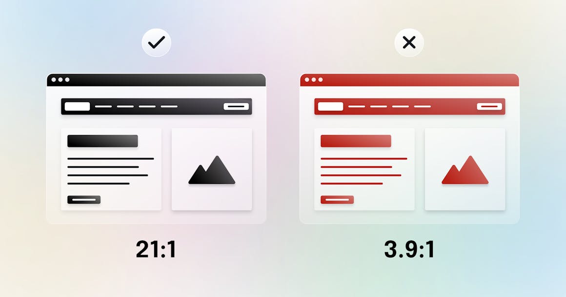
Color contrast is typically expressed as a ratio, where a higher number means a greater degree of contrast between the two colors. For example, black and white have a contrast ratio of 21 to 1 (the highest possible ratio), while red and white have a contrast ratio of just 3.9 to 1.
What Does WCAG Say About Color Contrast?
As I noted earlier, WCAG Success Criterion (SC) 1.4.3: Contrast (Minimum) requires a contrast ratio of at least 4.5 to 1. That means the combo of red and white mentioned above does not conform with WCAG in most use cases. However, there are three exceptions to this rule:
- Large Text: Large-scale text and images of large-scale text only need a color contrast ratio of at least 3 to 1.
- Incidental Text: Text or images of text that are part of an inactive user interface component (for example, a disabled input field), purely decorative, or part of a picture that contains significant other visual content do not have a contrast requirement.
Logotypes: Text that is part of a logo or brand name has no contrast requirement.
Did You Know? For its Level AA requirement, WCAG chose a minimum contrast ratio of 4.5 to 1 because it compensated for the loss in contrast sensitivity usually experienced by people with visual loss equivalent to 20/40 vision. 20/40 is the typical visual acuity of someone who is 80 years old.
How Do Font Size and Font Weight Affect Color Contrast?
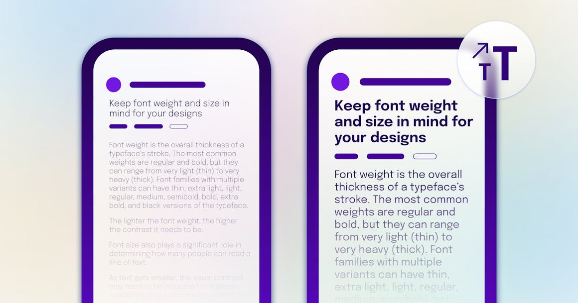
Font weight is the overall thickness of a typeface’s stroke. The most common weights are regular and bold, but they can range from very light (thin) to very heavy (thick). Font families with multiple variants can have thin, extra light, light, regular, medium, semibold, bold, extra bold, and black versions of the typeface.
The lighter the font weight, the higher the contrast it needs to be.

Font size also plays a significant role in determining how many people can read a line of text.
As text gets smaller, the visual contrast may need to be increased to maintain readability. Of course, the flip side of that is larger text can get away with slightly less contrast. According to WCAG SC 1.4.3: Contrast (Minimum), an 18-point font (or a 14-point bold font) only needs a contrast ratio of 3 to 1.
The smaller the font size, the heavier the font weight and higher the contrast it would need to be.

Pro Tip: This is why we recommend not going below 16-point font for body text.
What Are Some Common Contrast Pitfalls for Designers?
1. Using Too Many Images of Text
Images of text do not scale as well as text because they tend to pixelate. It’s also harder to change foreground and background contrast and color combinations for images of text, which is necessary for some users.
For those reasons, we suggest using text whenever possible — or at minimum, uploading an SVG or high-resolution image.
2. Using Too Much Contrast
If higher contrast can make it easier to read text, does that mean it’s possible to have too much contrast?
In a word, yes.
In fact, a recent study found that black text on a white background can cause eye strain. Without going too deep into the science (the study talks a lot about ganglion cells and contrast polarity), it’s sufficient to say that extremely high contrast can be taxing on the eyes — and is one of the reasons we recommend using a dark gray in place of pure black.
Get Help Designing for Accessibility
Want more tips on how to design inclusive experiences? Check out our Guide to Accessible Design. Or follow our blog for more accessibility tips, delivered to your inbox.
Want to hear more from AudioEye?
Get the latest accessibility news and resources, delivered to your inbox.
Ready to see AudioEye in action?
Watch Demo
Ready to test your website for accessibility?
Share post
Topics:
Keep Reading

The Digital Solution to the Healthcare Access Crisis: How Tech Companies Can Help
Discover how tech companies can close the healthcare access gap by prioritizing accessibility, improving usability, and designing inclusive digital tools.
accessibility
February 26, 2025

3 Digital Accessibility Trends to Watch in 2025
Digital accessibility will continue to be a top priority in 2025 as compliance deadlines near and public expectations grow. Key trends include stronger accessibility efforts in healthcare and government, better ways to measure compliance, and a shift away from quick fixes toward more comprehensive solutions.
accessibility
February 25, 2025

Using WCAG Success Criteria 1.3.1 to Improve Accessibility for Individuals with Cognitive Disabilities
Learn how WCAG Success Criterion 1.3.1 improves digital accessibility for individuals with disabilities, including those with ASD. Discover best practices to structure content for better comprehension and navigation.
accessibility
February 16, 2025
