How to Design for Color Blindness

Ready to see AudioEye in action?
Watch Demo
Learn effective strategies to use when designing for color blindness and how to use them to improve accessibility for over 300 million people worldwide.
Imagine this: you submit an online form and get an error message that reads, ‘Please correct form errors.’ You scroll down but there’s nothing showing where the errors are.
For the 300 million people globally who have some form of color deficiency, the scenario above is a daily occurrence. And because color is one of the most popular ways to convey information, these users face a number of challenges when trying to navigate the web.
Below, we’ll explain the impact color has on accessibility and share tips on how to design colorblind-friendly websites — without forgoing color entirely.
Understanding Color Blindness
Contrary to what the term color blindness may suggest, most people with color deficiency can see pigmentation. Rather than seeing no color at all, they have difficulty distinguishing between certain colors.
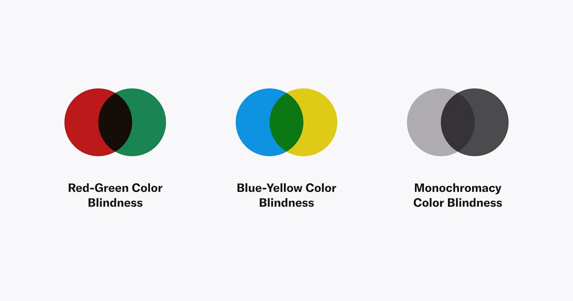
There are three different types of color blindness:
1. Red-green color blindness: This is the most common type of color blindness and causes individuals to confuse red and green. Types of red-green color blindness include:
- Deuteranomaly: Green looks red.
- Protanomaly: Red looks green and dull.
- Protanopia/Deuteranopia: Cannot distinguish between red and green.
2. Blue-yellow color blindness: Less common than red-green color blindness, this causes individuals to confuse blue and yellow. Types of blue-yellow color blindness include:
- Tritanomaly: Makes it hard to tell the difference between yellow and red or blue and green
- Tritanopia: Makes it hard to tell the difference between blue and green, purple and red, or yellow and pink. It also makes colors look less bright.
3. Monochromacy: This is the rarest form of color blindness and occurs in roughly 1 and 33,000 people. This is “true” color blindness with the individual being unable to see any colors.
Regardless of the type of color blindness an individual has, color blindness affects how easily someone is able to navigate the web. For example, links or buttons can be hard for individuals to follow if they’re not visible or have enough contrast or clarity. Text can also be hard to read if it’s not contrasted well with the background. Black text on a white background is particularly difficult to read for those with blue-yellow or red-green color blindness. The combination may cause eye strain or glare which reduces readability.
Ultimately, these issues result in a poor user experience for colorblind people, which makes it more difficult to complete day-to-day tasks.
Check Your Color Contrast
Color contrast makes the difference between a website that’s navigable and easy-to-use versus one that’s not. Without the right color contrast between elements, colorblind users may not be able to easily distinguish between them.
Providing good color contrast not only improves the user experience but also helps you conform to accessibility standards included in the Web Content Accessibility Guidelines (WCAG), which are enforced by the Americans with Disabilities Act (ADA). WCAG has three different levels of conformance: A (minimum standard), AA (standard), and AAA (highest). Each level has different recommendations for color contrast ratios:
- Level A and AA: Normal text should have a minimum contrast ratio of 4.5:1. Large text should have a 3:1 ratio.
- Level AAA: Normal text should have a ratio of 7:1 and 4.5:1 for large text.
At minimum, you should strive for Level AA or AAA to accommodate not just users with color blindness, but those with other visual impairments as well. It’s important to note that Level AAA is the highest level of web accessibility and provides maximum accessibility but it is more stringent in design constraints.
Best Practices for Color Blind Friendly Websites
Designing your website to be accessible for people with color deficiency doesn’t mean you have to forgo color entirely; you just need to be a bit more intentional with how you use it. Here are some best practices for designing with color blindness in mind — all of which contribute to a more accessible and inclusive design.
1. Don’t Rely on Color Alone
The overarching theme of designing for color blindness is not to be overly reliant on color. You shouldn’t use color as the only element that gets your users’ attention — or alerts them to key information. If you do use color to communicate information, be sure to combine it with another element (such as an error message or symbol) to help people with color deficiencies follow along.
2. Use Icons and Symbols
One of the most common ways to supplement color on a website is the use of icons and symbols. For example, universal icons like exclamation points can help draw a user’s attention. Going back to the example of a missing form field, you could combine a red outline with an exclamation point to indicate an error.

3. Use Textures and Patterns
When you need to emphasize certain objects, it’s a good idea to incorporate textures and/or patterns. This is especially helpful for charts and graphs where color is often used to differentiate between items. Adding textures and patterns like checkers, lines, and dots can help make each item stand out as unique and easily identifiable.
For example, if you’re including a map with different types of terrain, consider using different textures (like striped, dotted, crosshatched, etc.) alongside color. This helps to differentiate between various landforms, making it more accessible for individuals who are color blind.
Finally, if you’re going to include charts and graphs on your website, be sure to add alt text for people who cannot perceive items visually.
4. Use Labels
Using labels on your site can greatly improve the user experience for people who are color blind. Textures and patterns are great design elements for charts and graphs, but adding labels can make things clearer. It also helps those who use screen readers better navigate and understand what’s on your site.
Labeling is especially important if you have items on your website that are differentiated by color. For example, if you sell items on your website that come in different colors, labeling each option can help users know what they’re buying and help them make more informed buying decisions.
As added bonuses, adding labels can help increase your SEO rankings. Labels provide SEO bots with more information about what’s on your page. The more descriptive your labels, the higher your SEO rankings.
5. Go Bold
People with color blindness tend to have an easier time seeing thick and pronounced lines. Avoid using thin slivers of color, and make sure links are bold and pronounced. This will help enhance visual clarity and user focus. For example, using thick, bold lines under call-to-action (CTA) buttons can help users understand what their next steps are, which can decrease confusion and frustration.
6. Use Color Contrast Properly
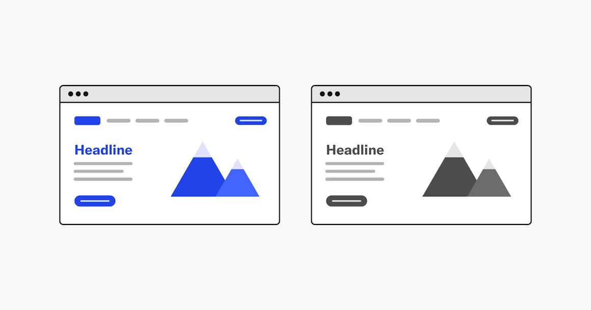
You can make your website’s components stand out to all users by properly using color contrast in your design. The trick is to use brightness and tone, in addition to hues. If you contrast by color, but maintain the same brightness, elements like look blended or muddled to those with color deficiencies.
Adjusting brightness and tone is not only a solid practice for color blindness accessibility, but it is best practice for overall UI design as well. You may find that contrasting with brightness and tone, rather than pigmentation, is also more satisfying aesthetically.
To get a better idea of how you are implementing brightness and tone contrasts on your site, look at it in grayscale.
7. Avoid Certain Color Combinations
Since color blindness affects individuals differently, merely avoiding certain hues is not enough. There are certain color combinations that can cause problems for users who are color blind. Some common combinations to avoid include:
- Green/red
- Green/blue
- Green/black
- Green/brown
- Green/gray
- Light green/yellow
- Blue/purple
- Blue/gray
Whenever possible, you should use a colorblind-friendly palette and accessible colors. However, if you do use any of the color combos above, be sure to provide alternative methods for portraying information such as subtitles, labels, focus elements, or icons.
8. Embrace Minimalism
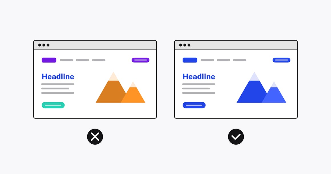
Having different color schemes and hues on your website can seem fun and appealing, but it can also be confusing and frustrating for people who are color blind. You can still have fun by sticking to a palette and using gradations, brightness, and tone. In addition to improving your site’s accessibility for people with color deficiencies, a minimalist design can also make your site look sleeker, more professional, and aesthetically pleasing.
Why Color Blindness Website Accessibility Matters
Color blindness affects a large percentage of individuals around the world, which means website owners have a responsibility — both legally and ethically — to create a colorblind-friendly website.
From a legal standpoint, a colorblind-friendly website adheres to the guidelines included in the ADA as well as the Accessibility for Ontarians with Disabilities Act (AODA) in Canada. Following these guidelines can help to decrease the risk of costly legal action, including lawsuits and demand letters.
For users, a colorblind-friendly website enhances the overall experience for users. These sites are typically minimalistic, cleaner, and more organized with better navigation and readability. With a more user-friendly website, you expand the reach of your audience which can result in more revenue opportunities and increased company reputation.
Testing and Feedback
As you’re designing your website — or making updates — it’s important to regularly test your site for appropriate color contrast. Using tools like a color contrast checker is a great place to start. These tools provide a high-level overview of where your existing contrast levels are and where improvements can be made.
However, to create a truly accessible design, it’s critical to involve users with color vision deficiencies in both the design and testing process. This enables you to gather authentic feedback on how accessible your digital content is and identify accessibility issues that software may not have found. Consider reaching out to local community organizations or on social media platforms to find colorblind individuals to be involved in the testing process.
As you're testing your digital content, be sure to gather feedback on color blindness accessibility along the way. Consider using surveys or feedback forms to capture their insights. You can then use these insights in your redesigns to continuously improve your site’s accessibility.
Leveraging AudioEye for Enhanced Color Blind Accessibility
Designing for color blindness website accessibility will optimize your site’s user experience for all users. With AudioEye, creating an accessible website for people who are color blind is easy. Our Color Contrast Checker determines whether your color combinations are accessible for those with color blindness or other visual impairments as well as if it complies with WCAG standards. This helps to simplify the process of creating user-friendly, accessible color palettes.
In addition to our color contrast checker, AudioEye’s Automated Fixes provide real-time fixes for common accessibility issues — including those related to poor color contrast. Our Expert Fixes supplement automated accessibility testing by involving accessibility experts and members of the disability community who find and fix accessibility errors. Together, the tools enhance the user experience for individuals with disabilities, including those with color vision deficiencies.
Ready to check if your website is accessible to people who are color blind, use our Color Contrast Checker.
Want more tips on designing accessible websites? Check out AudioEye’s Ultimate Guide to Accessible Web Design, which covers everything from color contrast ratios to accessible links.
Ready to see AudioEye in action?
Watch Demo
Ready to test your website for accessibility?
Share post
Topics:
Keep Reading

The Digital Solution to the Healthcare Access Crisis: How Tech Companies Can Help
Discover how tech companies can close the healthcare access gap by prioritizing accessibility, improving usability, and designing inclusive digital tools.
accessibility
February 26, 2025

3 Digital Accessibility Trends to Watch in 2025
Digital accessibility will continue to be a top priority in 2025 as compliance deadlines near and public expectations grow. Key trends include stronger accessibility efforts in healthcare and government, better ways to measure compliance, and a shift away from quick fixes toward more comprehensive solutions.
accessibility
February 25, 2025

Using WCAG Success Criteria 1.3.1 to Improve Accessibility for Individuals with Cognitive Disabilities
Learn how WCAG Success Criterion 1.3.1 improves digital accessibility for individuals with disabilities, including those with ASD. Discover best practices to structure content for better comprehension and navigation.
accessibility
February 16, 2025
