How to Achieve ADA Compliance on Your WordPress Site

Ready to see AudioEye in action?
Watch Demo
Unlock the secrets to WordPress ADA compliance with our guide. Boost accessibility, avoid legal risks, and enhance user experience on your site.
As of 2024, over 43% of websites are built on WordPress (WP). While it’s not surprising that many organizations turn to the platform for its flexibility and ease of use, what is surprising is that the majority of WordPress sites fail to comply with ADA accessibility laws.
As a WordPress website owner, it’s critical to ensure your site is accessible to individuals with disabilities. If not, you could be in violation of Title III of the ADA which can result in legal action such as lawsuits or demand letters. More importantly, you could be losing customers to competitors with a more accessible website.
To help make sure your site is ADA-compliant, you’ll need to know the best practices of accessible design as well as common accessibility issues to avoid. Let’s get started.
Why Does My Website Need To Be ADA Compliant?
First and foremost, ADA compliance is mandatory for most businesses. The ADA was designed to prohibit discrimination against individuals with disabilities in public places. While the ADA does not specifically mention websites, the U.S. Department of Justice has stated websites do qualify as public accommodations. This means your site must be accessible to people with disabilities. If it’s not, you’re in violation of the ADA which can result in potential legal action.
Every year, thousands of companies face litigation for alleged web accessibility violations, including major companies like Domnio’s and Hy-Vee Inc. In 2023, plaintiffs filed more than 4,600 ADA lawsuits against organizations with inaccessible websites. Organizations who are faced with these lawsuits can expect settlement costs of up to $25,000 — $10,000 for the settlement fees, $5,000 for defense fees, and between $5,000 to $20,000 for accessibility audits and remediation.
According to Kris Rivenburgh, author of The ADA Book,: “If you receive a website (or app) accessibility demand letter under the Americans with Disabilities Act (ADA) $25,000 is a conservative final tab after you're done at the buffet or plaintiff’s law firm.”
In addition to being costly, failure to comply with ADA regulations is damaging to your reputation. If your company is perceived as being neglectful towards the disabled community’s needs, it portrays a lack of empathy — something that today’s consumers expect of businesses. And with how quickly news can spread, it may not take long for news of the lawsuit to become public knowledge. This can result in more negative content that further amplifies the issue and negatively influences public opinion.
Ultimately, your organization has a legal and ethical responsibility to ensure your site is accessible. Creating an accessible website not only helps you avoid potential legal ramifications, but also helps you create a more accessible, inclusive online environment.
How to Ensure Your WordPress Website Adheres to ADA Compliance
Your website should provide equal access and a positive user experience for all users — regardless of their abilities, preferences, or the tools they use to browse the internet.
With that in mind, here are three tips to help you make your WordPress site accessible to all users:
1. Start With an Accessibility-Ready Theme
If you haven’t designed your website yet — or if you’re considering switching to a new theme — you can filter WordPress themes to view Accessibility Ready options. We recommend doing some research around each theme to ensure you’re picking one that is actually accessible. Consider looking at user reviews or which assistive technologies the theme supports. This will help you make a more informed decision.
It’s also important to remember that you can still introduce accessibility issues to accessible themes. For example, you might choose a color scheme that fails to meet the latest WCAG standards for color contrast, or fails to provide adequate alt text for images.
The bottom line: Choosing an accessibility-ready theme is an excellent first step, but you should still regularly test your website for accessibility.
2. Follow the Best Practices of Accessible Design
Digital accessibility isn’t just about accommodating people with visual impairments, hearing disabilities, or other disabilities. The goal is to improve online experiences for everyone.
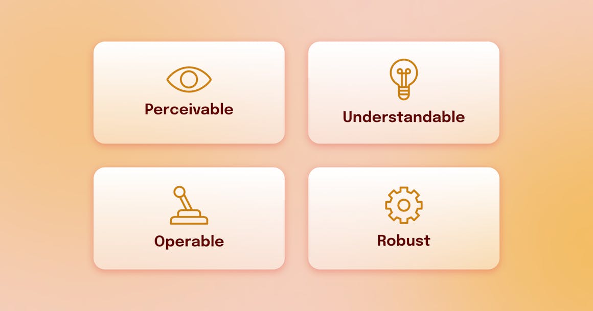
With this in mind, there are a few best practices around how to create an accessible design. These practices are based on the WCAG POUR principles which state:
- Content should be perceivable. It shouldn’t rely on a single type of sensory perception or be invisible to any of the senses.
- Content should be operable. You shouldn’t require interactions that users cannot perform. For example, you shouldn’t ask users to verify their identity using only visual cues as this prevents individuals with visual impairments from completing the action.
- Content should be understandable. Users should be able to understand the information on your website and the operations of its interface. More simply, users should be able to access your website and know exactly how to use it.
- Content should be robust. Your website should work with a wide variety of user agents, including screen readers and other assistive technology tools.
To ensure your content meets these requirements, your website should incorporate the following:
- Readable content: Users should be able to easily read and consume content. Using proper header structure, sentence format and length, font size, and color contrast ratios throughout your site has a huge impact on readability. You’ll want to ensure each of these elements is included on your site, is used correctly, and is optimized for screen readers.
- Clear call-to-actions (CTAs): Clear and descriptive CTAs provide users with helpful context on what will happen when they click on the button. This is especially important for screen readers as unclear CTA buttons can be confusing and disorienting.
- Alternative text: Also known as alt text, alt text describes non-text content such as images or graphs. This is critical for individuals with disabilities as lack of alt text creates a confusing experience for users.
- Accessible multimedia content: Ensure multimedia content such as videos or podcasts are accessible to users with disabilities. Using captions, transcripts, and audio descriptions is critical as they enable people with disabilities to consume the content.
For more accessible design best practices, download ‘A Comprehensive Guide on Accessible Web Design.”
3. Audit Your Website for Accessibility
Regularly testing your website and digital content against WCAG is the best way to find and fix accessibility problems before they impact your customers. Take AudioEye’s Expert Audits for example. Using both automated testing and expert audits, our platform uncovers accessibility issues on your webpages and provides recommendations for remediation. This helps you prioritize which accessibility issues to fix first and create a path towards a more accessible web design.
How to Set an Accessibility Goal for Your WordPress Site
The steps mentioned above are a great starting point for ADA-compliance. However, it’s important to remember accessibility is not a “one-and-done” effort. It requires long-term effort and continuous monitoring to ensure your site meets accessibility and inclusivity standards. Setting an accessibility goal can help with this.
To set a WP accessibility goal, we recommend following the guidelines outlined in the Web Content Accessibility Guidelines (WCAG). WCAG contains 86 success criteria — pass-or-fail statements — that address accessibility issues such as low-contrast text, missing video captions, keyboard navigation issues, and missing alt text. These criteria are organized into three levels of conformance: Level A (least strict), Level AA, and Level AAA (most strict). Most WordPress sites should aim for Level AA conformance with the latest version of WCAG (2.2 as of October 2023).
With this in mind, here’s how to set an accessibility goal:
- Conduct an accessibility audit of your existing site to assess your site’s current accessibility level.
- Identify where on your site you’re not meeting WCAG guidelines. This may include the accessibility issues we mentioned above.
- Prioritize accessibility issues based on their impact and the level of effort required for remediation.
- Determine which level of accessibility you’d like to meet (i.e. Level AA of WCAG 2.2) and a timeline for when you want to achieve this.
- Document your goals in a clear, concise manner.
- Assign resources, responsibilities, and deadlines to your team.
- Continuously track your progress.
As you’re working towards meeting your accessibility goals, be sure to pay attention to changes in accessibility standards as this may shift your goal or project timeline a bit. Additionally, you’ll need to regularly audit your site for accessibility issues. Every time you update your site or add new content, you risk introducing new accessibility issues. Regular monitoring enables you to find and fix them before they impact your customers.
Common Accessibility Issues for WordPress Sites
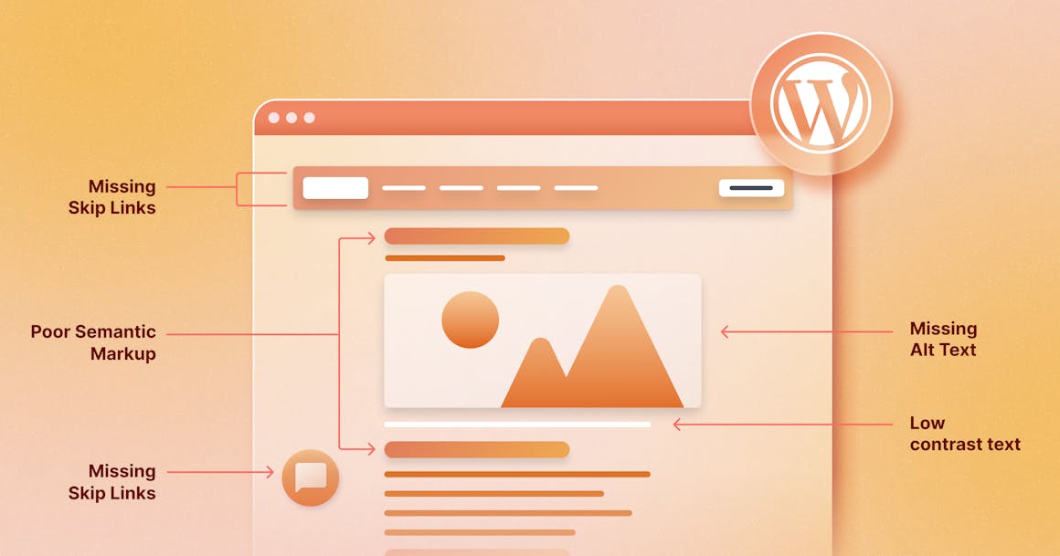
Even though WordPress offers a number of default templates that follow the latest accessibility best practices, accessibility barriers can still exist — no matter which template you use. Some of the most common accessibility issues include:
Missing Text Alternatives
According to WCAG Success Criterion (SC) 1.1.1., all non-text content should have a text alternative. This enables people to change the way content is presented to fit their needs and preferences.
For example, if an e-commerce site adds image alternative text (also called alt text) to all of its product images, people who use screen readers can understand what each one depicts.
WordPress’s Media Library supports alternative text for images, but content creators still need to write descriptive, accurate alt text.
Installing Inaccessible Plugins
WordPress plugins allow developers and content creators to add new features or extend existing functionality. Unfortunately, some plugins aren’t designed for accessibility — even those labeled ‘WordPress accessibility plugins’.
For instance, some media player plugins might not have customizable controls, which could lead to a frustrating experience for people who browse with a keyboard alone (no mouse).
Likewise, adding a form to your website via a plugin might help potential customers reach your business — but if the form doesn’t use appropriate markup, keyboard users may become “trapped” on one of the fields and won’t be able to complete the form.
Low-Contrast Text
In the accessibility space, color contrast refers to the difference in light between a foreground element (like text) and its background. WCAG SC 1.4.3 lays out specific requirements for the minimum level of color contrast for web content.
If your website fails to meet these thresholds, people with color vision deficiencies (CVD) and other visual impairments may be unable to read your text.
To check your site’s color contrast, use AudioEye’s free Color Contrast Checker.
Missing Skip Links
Skip links (also called skip to content links) enable people using keyboards, screen readers, switch controls, and other assistive technologies (AT) to reach the content they want faster. The most common skip link is the first interactive element on a page, which lets users skip past global elements like the logo, search bar, and header menu.
Many WordPress themes have built-in skip links, which may not be visible until the user presses tab. However, some themes don’t include this important accessibility feature, and creators may unintentionally disable skip links when updating their content. Others may be missing clear link text which provides assistive technology users an idea of what happens when they click on the link.
To see an example of a skip link, reload this page and press the tab key.
Inadequate Form Accessibility
WCAG SC 3.3.2 requires forms to include instructions or labels so users understand what type of data input is expected. WordPress forms that are missing clear labels can confuse the reader.
For example, a form field labeled ‘Date’ can be confusing as users may not know which format you’re looking for. Or someone may enter their nickname in a ‘Name’ field if a ‘Legal Name’ label isn’t included.
Additionally, forms with poor error handling can be confusing for the user. For example, screen reader users may try to submit a form and be unaware of an error until they encounter an indicator. If the error message is not easily visible or doesn’t provide corrective actions, they’ll likely leave your site. Error messages should clearly highlight where the error occurred and what steps need to be taken to resolve them.
How AudioEye Helps Wordpress Users Create Accessible WordPress Content
To increase the accessibility of your WordPress site, there’s AudioEye. Through our continuous investment in research and development, we’ve created an Automated Accessibility Platform. Using powerful automation software, we carefully audit your web pages for common accessibility issues and apply automated fixes in real-time.
But we also recognize the role of human expertise in delivering the highest level of accessibility to people with disabilities. To that end, we provide expert human testing and remediation services and use the insights from our audits — run by certified testers and members of the disability community — to develop new automated fixes and solve issues proactively.
With AudioEye’s seamless CSS integration into your WordPress environment, you’ll get so much more than just an accessibility toolbar widget. AudioEye provides you with a comprehensive accessibility solution that gets you started on the path to ADA-compliance and better usability.
Ready to get started? Book a demo to see AudioEye in action.
Ready to see AudioEye in action?
Watch Demo
Ready to test your website for accessibility?
Share post
Topics:
Keep Reading

What’s New in WCAG 2.2: Changes and Updates from WCAG 2.1
Meeting WCAG 2.1 requirements doesn’t mean you conform to WCAG 2.2. Find out what’s changed and how to adapt your site or app.
compliance
April 07, 2025
ADA Demand Letter: What It Means & What to Do If You Get One
ADA demand letters are becoming more common. Understand what they are, how to respond, and how to reduce your legal risk moving forward.
compliance
March 28, 2025

Why an Accessibility Widget for Your Website Isn’t Enough — and What to Do Instead
Widgets seem like an easy way to ensure compliance with accessibility regulations, but your site/app needs more than they offer. Here’s how to approach it.
accessibility
compliance
March 25, 2025
