My Favorite Tools for Accessible Design
My Favorite Tools for Accessible Design

Ready to see AudioEye in action?
Watch Demo
Ever wonder how AudioEye's design team makes sure our digital content is accessible to all users? Check out the tools our team uses every day.
Want to know my least-favorite phrase as a designer? (And no, I’m not counting “Can you just make it pop more?”)
“It’s just an edge case.”
The “it” in question? Accessibility.
The reason? Some designers think it’s harder to design for accessibility. And others don’t realize how relevant accessibility is to their job.
They’re wrong.
If you have a website, you need to design for accessibility. Otherwise, you’re creating barriers for the one in four U.S. adults — roughly 61 million people — who live with a disability.
Not exactly an edge case.
Fortunately, there are tools to help you design websites and digital content that is accessible to people with disabilities. In this post, I’ll share three of my favorites — plus tips on how you can get the most out of them.
Looking to improve your past work's accessibility? Find issues on any webpage with this free web accessibility checker.
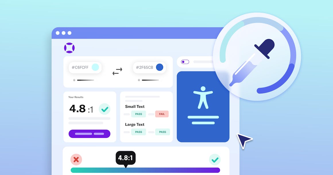
AudioEye’s Color Contrast Checker
You probably don’t need a special tool to tell you that coral pink text on a fuschia background is hard to read.
But what about white text on a red background?
For people with visual disabilities, color contrast can be the difference between a website that is clear and easily navigable and one that is completely illegible. Almost all types of visual impairments — from myopia to macular degeneration — can make it more difficult to read text when the color contrast is low.
AudioEye’s Color Contrast Checker makes it easy to determine if your colors meet the Web Content Accessibility Guidelines (WCAG) on contrast ratio. To conform with Success Criterion (SC) 1.4.3 Contrast (Minimum), you should aim to have a contrast ratio of at least 4.5:1 between the foreground and background color.
Oh, and for the record: white text on a red (#FF0000) background only has a contrast ratio of 3.99:1. Close, but not conforming.
With the Color Contrast Checker, you can use the luminance sliders for the “background color” to find a red value that is Level AA compliant (#EB0000) or Level AAA compliant (#B30000).
W3C’s Alt Text Decision Tree
One of the best parts of my job is the opportunity to talk with AudioEye’s A11iance Team and other members of the disability community.
Something that comes up all the time is the importance of image alternative text. Or rather, alt text that actually provides value for people who cannot perceive images visually.
“Alt text helps my design process. Are my concepts coming through when I write out what I illustrated? Does the image serve its intended purpose? Or is it purely decorative?”
– Sarah Ippen, Visual Designer at AudioEye
Plenty of designers and content creators struggle with alt text, whether it’s failing to provide any or writing something so non-descriptive — like an image of a menu that’s simply labeled menu — it might as well not be there.
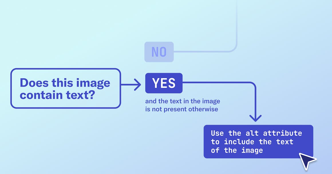
To help people write better alt text, the World Wide Web Consortium (W3C) created a decision tree that describes how to use the alt attribute of an image depending on its purpose and content.
For example, you can use an empty alt attribute if an image includes text that is also present as real text nearby. But if the image’s text is not otherwise present on the page, you should include it in the alt text.
Text Resizer (Figma Community)
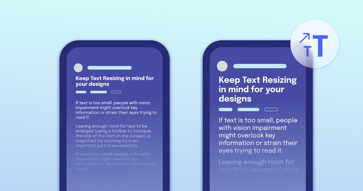
Figma has a number of community plugins that you can use to check your design’s accessibility. One of my favorites is the Text Resizer, which lets you clone part of your design and see how it works with different text sizes.
Leaving enough room for text to be enlarged (by programmatically increasing the size of the text on the screen) or magnified (by zooming in) is an important part of accessibility. If text is too small, people with vision impairment might overlook key information or strain their eyes trying to read it.
As a best practice, I recommend using a scalable unit like rem for text size. For your page’s main text, make font-size at least 1rem and supplementary information — such as copyright details — at least 0.75 rem. At AudioEye, we set 1 rem at 20px, and the best practice is to set 1 rem to at least 16px.
There’s also a compliance angle to text that can be easily scaled. WCAG SC 1.4.4 Resize text requires that text can be resized without assistive technology up to 200 percent without loss of content or functionality. The rule doesn’t apply to captions and images of text.

What’s Next for Accessibility?
As a designer, it’s really exciting to hear more companies talking about accessibility. The more we can embed accessibility into our design processes (not to mention our overall business strategies), the better off everyone will be.
Want to get a sense of where AudioEye thinks accessibility is headed? Download our white paper on Building for Digital Accessibility at Scale.
Ready to see AudioEye in action?
Watch Demo
Ready to test your website for accessibility?
Share post
Topics:
Keep Reading
7 Websites That Got Accessibility Right (and What You Can Learn)
Looking to create an accessible website? See how seven companies utilized accessibility best practices to create a seamless user experience that works for all.
accessibility
April 11, 2025
Why People + Automation Is the Right Approach to Accessibility Testing
Discover how using both automated and manual accessibility testing is the perfect approach to creating accessible, compliant digital content.
accessibility
April 08, 2025
Is WCAG Certification Possible? 6 Things You Need to Know
While WCAG standards don’t offer official certification, there are training programs and professional credentials that can boost your accessibility expertise. Learn more.
accessibility
April 03, 2025
