What is Dyslexia?

Ready to see AudioEye in action?
Watch Demo
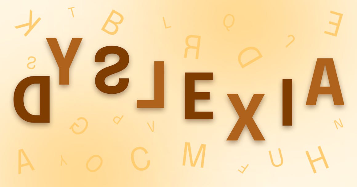
Dyslexia is a general term for learning disabilities related to difficulty with reading, writing, and spelling. It is called a learning disability because it can impact a student’s learning experience by making it more difficult to process information. But dyslexia is not related to intelligence, it just means that people with dyslexia may need more time or a different method to process information. Dyslexia is caused by difficulties with language processing and visual processing; there is a broad spectrum of how dyslexia can impact a person’s ability to access information.
Dyslexia is a general term for learning disabilities related to difficulty with reading, writing, and spelling. It is called a learning disability because it can impact a student’s learning experience by making it more difficult to process information. But dyslexia is not related to intelligence, it just means that people with dyslexia may need more time or a different method to process information. Dyslexia is caused by difficulties with language processing and visual processing; there is a broad spectrum of how dyslexia can impact a person’s ability to access information.
Dyslexia is the most common learning disability.
As many as 17% of U.S. schoolchildren may have dyslexia.
As many as 85% of students with learning disabilities has dyslexia alone or with other conditions.
Source: Understood.org
Technology’s Potential to Enhance Access to Information
Technology can be a huge asset for people with disabilities. The right software for a person with a disability, can help them access information and complete tasks. Specifically, for students who are frustrated when reading or writing, technology can provide support and enable students to succeed. Technology’s flexibility can accommodate diverse needs of people with dyslexia; information can be presented in a manner that is easiest or most effective for that user to be able to consume it. In order to make sure that technology enhances the experience for people with disabilities, we must make sure that it is accessible.
Web Accessibility Benefits Users with Dyslexia
The internet brings easy access to a lot of information, but if it is not accessible, then people with disabilities can be excluded from that opportunity to engage. Accessibility focuses on making web content accessible to all users. People with dyslexia may use screen readers to have text read aloud or other tools, like the AudioEye Ally Toolbar, to customize the appearance of a website. Users can change the font or color combination to present information in a manner that meets their needs.
When technology is made accessible, information can be presented in a variety of ways so that people with dyslexia can have a personalized experience that suits their needs.
6 Key Improvements that have a Major Impact on Users with Dyslexia
Appearance
- Alignment and spacing:
Avoid using justified text and placing double spaces after a period. The justified text can make letters space out, making it hard to identify the spaces between words and it can create gaps in the overall appearance of the paragraph. The gaps created by justified text can also be created by double spaces after periods. The gaps or white spaces created in a paragraph can create the effect of “rivers” or connected blank areas that end up looking like shapes and hurt readability. - Color Combinations:
Color preferences can vary for different users so it is best to offer customization options. Although black text on a white background is most common, studies have shown that Dyslexic users prefer black text on a yellow background. For some users, a lower contrast between the text and background colors is easier to read. Sometimes, black text on a white background can be too stark of a contrast and make the letters appear to vibrate on a page for a user with dyslexia.
Source: W3C
Example of problematic alignment, spacing, and color combination showing the river effect and black text vibrating on a white background:
Example of improved alignment, spacing, and color combination showing the black text on a yellow background:
Readability
- Font:
For users with dyslexia, sans serif fonts can be easier to read. Sans serif fonts, like Helvetica, do not have decoration at the ends of the letterforms. Serif fonts, like Times New Roman, do have decorations like feet or hooks on the ends of the strokes of the letters. These decorations can make the letters appear to connect or blend together, which makes reading difficult for users with dyslexia. Another option is to allow the user to customize their font and include an option for the OpenDyslexic font, which is designed to improve readability for users with dyslexia (OpenDyslexic Font). - Font Size:
Avoid using a font size that is smaller than 12pts. For many users, small fonts can make text difficult to read, but it increases the difficulty for users with dyslexia. It is important to use percentages or ems to define font size so that the user has the ability to change the size, if they need to.
Source: Accessites.org
Example of problematic serif font and small font size showing letters blurring together making it difficult to read:
Example of improved larger font size and showing the OpenDyslexic font:
Example of improved larger font size and showing the OpenDyslexic font:
Comprehension
- Paragraph sizes:
Try to keep paragraphs short and easy to read. Long blocks of text can be overwhelming for a user with dyslexia. Since it takes users with dyslexia more time to process information, it is beneficial to provide content in smaller, easy to digest blocks. It is helpful to use headers and lists to break up pages with a lot of information; this also helps reinforce the meaning of the content visually. Within the paragraphs, it is also important to write clearly and simply in order to communicate effectively. - Line Length:
Avoid long line lengths that stretch the width of the window. Long lines of text are difficult for all users to follow across a page without losing their place in a paragraph. This is especially a problem for users with dyslexia. The optimal line length is 75 characters, including spaces. Try to find a width that works well with your standard font size and set a percentage width so that the margins increase responsively to a wider screen.
Example of problematic long paragraphs and long line length:
Example of improved paragraph formatting and line length:
These suggestions are just some of the ways to improve the web experience for users with dyslexia. There is a broad spectrum of ways that dyslexia impacts a user’s experience so it is best to keep in mind that user customization offers the most flexible solutions. And by allowing users to customize their experience, you will end up addressing the needs of users with and without dyslexia.
How AudioEye Makes Links Accessible
As part of the Auditing, Training, and Consulting service, which is included for customers adopting the AudioEye Ally Managed Service, AudioEye evaluates websites in consideration of the many touch points outlined in this article. To assist designers, developers, and content authors, AudioEye reports back findings to assist accessibility stakeholders in optimizing their sites to accommodate individuals with dyslexia.
AudioEye Web Personalization Tools
Built into the AudioEye Reader, one of the many essential tools included within the Ally Toolbar, AudioEye includes several options for customizing the visual display of site content and, in particular, the web copy displayed on each individual page. These customization options include the capacity to change the font to the OpenDyslexic font demonstrated, above. In addition, users are supplied with various controls for customizing the text size,color contrastbetween the text (foreground) color and the background color, the spacing between letters, and the line height. These personalization options are unique for each user and, once set, the user experience persists as a user navigates from page to page across an AudioEye enabled website or transitions from one AudioEye enabled site to another.
Additional Sources:
International Dyslexia Association – Dyslexia Basics
Accessites.org – Designing for Dyslexics
Ready to see AudioEye in action?
Watch Demo
Ready to test your website for accessibility?
Share post
Topics:
Keep Reading
7 Websites That Got Accessibility Right (and What You Can Learn)
Looking to create an accessible website? See how seven companies utilized accessibility best practices to create a seamless user experience that works for all.
accessibility
April 11, 2025
Why People + Automation Is the Right Approach to Accessibility Testing
Discover how using both automated and manual accessibility testing is the perfect approach to creating accessible, compliant digital content.
accessibility
April 08, 2025
Is WCAG Certification Possible? 6 Things You Need to Know
While WCAG standards don’t offer official certification, there are training programs and professional credentials that can boost your accessibility expertise. Learn more.
accessibility
April 03, 2025
