What Businesses Get Wrong About Designing for Dyslexia
What Businesses Get Wrong About Designing for Dyslexia


Ready to see AudioEye in action?
Watch Demo
Dyslexia is the most common learning disability, but plenty of businesses don’t know how to address it. Here’s what you need to know.
October is Dyslexia Awareness Month, but plenty of businesses still struggle to build websites that are accessible for the 40 million U.S. adults living with dyslexia, many of whom are undiagnosed.
One reason for this? Most people have a narrow view of what dyslexia is — and that can influence how they approach the disability.
For example, it’s true that some people with dyslexia flip similar-looking letters (like p and q) in their head. And others experience the sensation of letters that appear to jump between lines or across the page.
But that isn’t true for everyone with dyslexia. And the common solution for these issues — namely, choosing an accessible font — isn’t the right fix for everyone.
In this post, we share four tips to help you make your digital content accessible for people with dyslexia.
Get a free scan of your site for common accessibility issues that affect people with dyslexia →
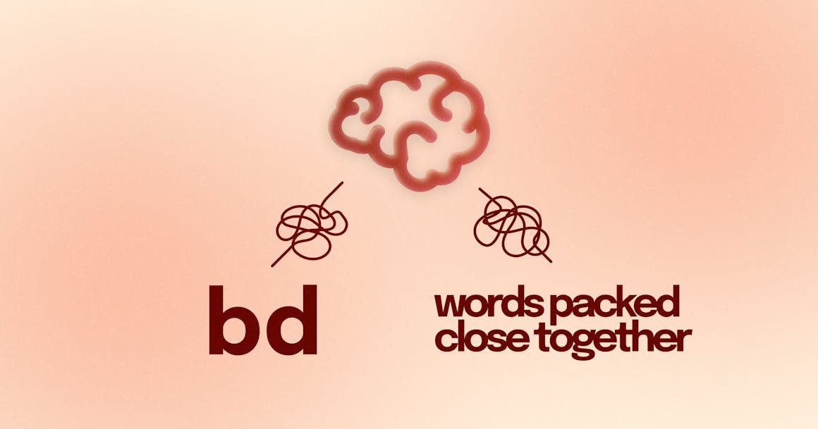
1. Font Choice Matters, Even if It Isn’t a Cure-All
When it comes to designing for dyslexia, the conversation usually starts and ends with font choice. And that makes a lot of sense. Picking an accessible font feels like a simple fix — the kind of checklist item businesses can do once and not think about again.
As we noted above, however, the spectrum of dyslexia is too broad to be solved by font choice alone. But that doesn’t mean you should ignore the value of picking the right font.
Although the Web Content Accessibility Guidelines (WCAG) don’t require a specific typeface, they do recommend choosing one that is simple and unadorned. Here are three things to consider as you evaluate different fonts:
- Use sans serif fonts: Serif fonts are typefaces that have extra strokes (commonly referred to as tails) attached to the end of each letter. These strokes can make it harder to distinguish between letters.
- Make sure there’s enough space between letters: Character spacing, or kerning, also plays an important role in accessibility. If there is not enough space between letters, they can be mistaken for other letters (for example, r and n can look like m).
- Consider fonts designed for dyslexia: Often characterized by heavy, bolder bottoms that give each letter a unique shape, fonts designed for dyslexia (like OpenDyslexic) are meant to prevent letter flipping.
Want to learn more about accessible fonts? Check out our post on the 10 Best Fonts for Dyslexia.
2. Enable Text Customization
In order to read text comfortably, some users need to be able to change the way it is displayed. This includes changing the text size, spacing, font, and color.
WCAG Success Criterion (SC) 1.4.12: Text Spacing requires that “no loss of context or functionality occurs” when changing line height (line spacing) to at least 1.5 times the font size, with additional requirements for paragraph spacing, letter spacing, and word spacing:
- Spacing following paragraphs to at least 2 times the font size.
- Letter spacing (tracking) to at least 0.12 times the font size.
- Word spacing to at least 0.16 times the font size.
If a user changes any of these properties, no information or functionality should be lost — and the text should reflow so they don’t have to scroll horizontally to read it.
3. Embrace White Space
According to the World Wide Web Consortium’s (W3C) Supplemental Guidance to WCAG 2, putting white space around objects and text can help reduce clutter and draw focus to important content.
For people with cognitive or learning disabilities, white space has been shown to ease reading difficulties and improve comprehension. And like other accessibility best practices, it has the added benefit of making pages easier to navigate and read for everyone.
I need a good use of white space, so that the chunks are clear and the page does not get overwhelming.
— a dyslexic user, to the W3C
Here are three ways to use white space well:
- Break up paragraphs: Use images, diagrams, and graphics to help break up text. However, be sure to provide descriptive alt text for anyone who cannot perceive images visually.
- Avoid multiple columns: Left align text, without justification. This will help readers to find the start and finish of each line — and ensure even spacing between words.
- Enable customization: Give users the ability to easily adjust white space around objects and text.
Pro tip: Don’t forget that “white space” is just a name. It’s fine if your website or digital content has a different background color. Just make sure you have enough contrast between the text and background.
4. Use Clear Language
We’ve talked quite a bit about the visual presentation of text, but it’s important to remember that dyslexia is a problem with language, not with vision.
The W3C’s Supplemental Guidance to WCAG 2 includes best practices for clear and understandable content, such as:
- Use active rather than passive voice: Speaking directly to the user in an active voice can help with comprehension, especially for people with dyslexia and other language impairments. For example, more people will understand “press the button” than “the on button should be pressed.”
- Avoid double negatives or nested clauses: Clear, simple language can help people with dyslexia and other language impairments understand a page — and any key actions they should take. For example, “Time is limited” is clearer than “Time is not unlimited.”
- Be concise and avoid long, dense paragraphs: Use short sentences with one point per sentence. Try to insert the key takeaway or objective at the start of the paragraph. When possible, use bulleted or numbered lists.
- Use short, descriptive headlines: For people with language or memory impairments, descriptive headlines can help process pages faster and navigate to the content they want to read.
Ready to Test Your Website’s Accessibility?
Want more tips on making your website accessible to all users? Check out our white paper on Building for Digital Accessibility at Scale. Or, get a free scan of any URL to uncover accessibility issues on your website.
Ready to see AudioEye in action?
Watch Demo
Ready to test your website for accessibility?
Share post
Topics:
Keep Reading
7 Websites That Got Accessibility Right (and What You Can Learn)
Looking to create an accessible website? See how seven companies utilized accessibility best practices to create a seamless user experience that works for all.
accessibility
April 11, 2025
Why People + Automation Is the Right Approach to Accessibility Testing
Discover how using both automated and manual accessibility testing is the perfect approach to creating accessible, compliant digital content.
accessibility
April 08, 2025
Is WCAG Certification Possible? 6 Things You Need to Know
While WCAG standards don’t offer official certification, there are training programs and professional credentials that can boost your accessibility expertise. Learn more.
accessibility
April 03, 2025
