What is the Best Font for ADHD?

Ready to see AudioEye in action?
Watch Demo
Fonts like Verdana and Open Sans are considered more readable for users with ADHD or cognitive disorders. Below, we’ll discuss how these fonts affect the user experience and how to design an ADHD-friendly site.
Have you ever noticed that some fonts pull you right in? They capture your attention and make it easy for you to skim content. Others though — it’s like trying to navigate through a maze (we’re looking at you Pacifico).
For those with attention deficit hyperactivity disorder (ADHD), however, font makes a huge difference in their online experience. The right font choice makes the text clear and enhances readability. The wrong font — it can muddle text, resulting in a confusing or frustrating experience.
That’s where ADHD-friendly fonts come into play. But what font styles are the most friendly to ADHD users? And do they really make that big of an impact on the user experience? Below, we’ll discuss which fonts are best for ADHD and how these typefaces affect overall accessibility.
Serif Fonts. Sans Serif Fonts
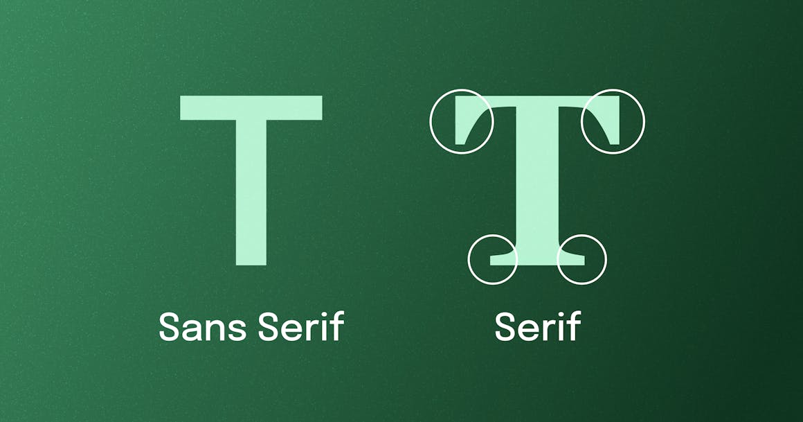
Before we jump into specific fonts, a quick distinction between Serif and Sans Serif fonts.
Serifs are those little tails and feet you see on the ends of letters — the image has them highlighted. Serif fonts, as you can imagine, include those tails and feet on their lettering. Sans Serif fonts are fonts that do not include serifs — hence the ‘sans’ in the name.
There’s some debate regarding which fonts are easier for individuals with ADHD to read. For some ADHD individuals, Sans Serif fonts, like Open Sans or Grotesque fonts, are more readable. Some feel the tails and feet on Serif fonts make it harder to distinguish between letters, though it depends on the font.
It’s important to note no one font’s better for ADHD users. Some Grotesque fonts, including Acherus, Aqsa, and Quartz, are Sans Serif fonts with a simple, clear typeface, which can improve legibility for users with ADHD.
However, some Serif fonts, particularly those in the Humanist style, do not detract from readability. For example, Centaur’s light and slender appearance and moderate stroke contrast may be easier to read for some ADHD users.
Ultimately, readability is determined by the user — what works for some may not work for others. However, it’s still critical to keep font choice in mind throughout the design process. Doing so ensures digital content is accessible not just to those with ADHD but also to those with other disabilities.
What Makes a Font More Accessible for ADHD Users?
As we mentioned above, font choice plays a huge role in accessibility — not just for those with ADHD but with other disabilities. This includes people with low vision, dyslexia, learning or cognitive disabilities, aphasia, and more.
Readability and legibility both impact how accessible a font is for ADHD users. Legibility refers to how quickly and accurately the reader can recognize a specific character in a writing system. More simply, legibility is how easily someone can understand the shape of a letter while reading.
Readability is how smoothly and quickly someone can read a passage of text, regardless of the context. Letter and line spacing plays a huge role in readability. The smoothness and spacing of letters and lines can determine how easily the eyes can fixate during a saccade (a quick, voluntary ballistic eye movement).
For users with ADHD, readability and legibility are two of the most critical factors that make a font more accessible. Below are some additional factors to consider when selecting fonts:
- Avoid imposter letter shapes: Many fonts have letters identical to others. For example, a lowercase ‘i’ and the number ‘1’ can look similar in specific fonts (Gill Sans is a perfect example). Look for typefaces that have distinct features on each letter. This will make it easier for users to distinguish between letters.
- Letters should be distinguishable: Mirroring (or letter reversal) occurs when letters look similar. For example, ‘q’ and ‘p’ or ‘d' and ‘b’ may look identical in specific fonts. Ensure the font you’re using clearly distinguishes these letters to decrease confusion.
- Good letter spacing: The closer letters are to each other, the harder it is for users to identify individual letters. For ADHD users, tight letter spacing creates visual crowding, which makes it harder to focus and recognize characters. Ensure whatever font you’re considering has good letter spacing, which increases readability.
- Noticeable difference in capital height and ascenders: For ADHD users to quickly and correctly decode letters, there needs to be a noticeable difference between letter heights and ascenders. Look for fonts with this feature as it will improve character recognition for ADHD users.
Best Fonts for ADHD
Here’s the thing: there’s no one font that is best for users with ADHD. Rather, there are a few typographies that are generally better for readability, legibility, and attention. Let’s get into it.
Verdana
With its tall letters, bold outlines, good spacing, and strong distinction between similar-looking characters, Verdana is an ideal font for ADHD users.
Open Sans
The optimized spacing and well-defined shapes of Open Sans easily guide readers’ eyes through online content which improves the overall reading experience.
Comic Sans
Despite the negative stigmas around Comic Sans, the font is actually beneficial for ADHD users. The unique shape of the letters and increased spacing makes words appear less crowded and easier to read.
BBC Reith
Named after the founder of BBC, John Reith, BBC Reith is designed to improve the reading experience for everyone. For ADHD users, the font’s open counters, narrow characters, and distinctive ascenders increase focus and readability.
Carnaby Street
Carnaby Street is a warm, narrow sans font available in three styles (Clean, Rough, and Blowout). The vintage-style font includes strong rectangular framing and softer rounded elements, both of which increase letter distinction and overall readability.
Bionic Reading
Created by Swiss developer Renato Casuut, Bionic Reading was designed to make reading easier for users with attention or learning disabilities by “guiding the eyes through artificial fixation points.” The font bolds the first few letters in a word, focusing the eyes while the brain fills in the rest. The font does have a simple, clean look, which is generally better for ADHD users.
However, there is some debate about whether the font is actually accessible for those with disabilities, including those with ADHD. The font has received a lot of support on social media from those with disabilities; however, actual data on the usefulness of the font is lacking.
When it comes to Bionic Reading, it ultimately depends on the user — for some it works well and improves their reading experience. For others, Bionic Reading can make it more difficult to read.
Why Font Choice Matters for ADHD
Imagine you’re reading a book where every letter is slightly blurred or harsh on your eyes. That’s kind of what the wrong font does for people with ADHD. It essentially makes text less approachable and harder to read. The right font choice has the opposite effect — it enables people with ADHD to easily focus on the content and enjoy a smoother reading experience.
Along with improving focus and readability, ADHD-friendly fonts can improve the user experience for both ADHD users and other users. As we mentioned above, these fonts are generally clean, and simple, and denote a friendly vibe — all of which enhance readability and better keep users’ attention. Essentially, you’re minimizing disruptions and distractions that hinder users from focusing on content.
Most importantly though, choosing an ADHD-friendly font creates a more accessible, inclusive experience for users with disabilities. By creating a more inclusive site, you’re better positioned to serve users — and that’s all users, not just those with disabilities.

Best Practices for Designing Web Content for ADHD Users
In addition to choosing an ADHD-friendly font, there are a few other design best practices you can implement to improve the experience for ADHD or neurodivergent users. These include:
- Maintain consistency: Ensure similar web elements on your site work the same way. Following standard design patterns can help prevent user errors and create a more seamless user experience.
- Keep things simple: Too much information on digital content can make it difficult for all users to focus. Keep your content and overall design simple — this decreases the cognitive load on users and increases user response time and accuracy.
- Ensure content is communicated clearly: Users should be able to quickly understand the content they’re presented with. Important content or next steps should be noticeable, distinguishable, and interpretable from other elements on the page.
- Include zoom feature: Enabling users to zoom in on your digital content is very beneficial for ADHD users or those with cognitive disabilities. The feature allows them to minimize distractions and focus on specific information.
- Use affordances and signifiers: Put simply, an affordance is a “guess” on how a web element will behave when it’s interacted with. Signifiers are icons, labels, or sounds that define where and how an action should be performed. Ensure you have both affordances and signifiers throughout your digital content as it helps users understand how to use your digital content.
- Ensure you have good color contrast: Having good color contrast between text or web elements can make it easier for ADHD users to distinguish between elements and more easily process information. Shoot for a color contrast ratio of 4.5:1 for normal text and 3:1 for large text. A color contrast checker can help with this.
- Test designs and fonts: Finally, as you’re selecting a font or other design elements, test these elements with actual users — especially those with disabilties. With these insights, you can make any necessary adjustments that can improve the user experience.
Create Accessible Attention-Grabbing Digital Content with AudioEye
The font you use can have a major impact not just on individuals with ADHD, but also for people with various disabilities.
Remember: font isn’t just about making your site look good — it’s about making it feel right. Using fonts like Verdana, Open Sans, and BBC Reith are just a few fonts that can help a site feel right.
Font choice is just the first step towards enhancing accessibility for users with disabilities. There are numerous other factors that all play a key role in making an accessible site. The best way to get started? AudioEye.
AudioEye’s Web Accessibility Scan finds common accessibility issues on your website, giving you a great starting point for remediating accessibility issues. Our Automated Accessibility Platform further enhances accessibility by automatically finding and fixing common accessibility issues. AudioEye’s team of accessibility experts goes further into your digital content to identify complex accessibility issues and provide custom remediations.
Ready to increase accessibility? Get started with a free accessibility scan.
Frequently asked questions
Ready to see AudioEye in action?
Watch Demo
Ready to test your website for accessibility?
Share post
Topics:
Keep Reading
7 Websites That Got Accessibility Right (and What You Can Learn)
Looking to create an accessible website? See how seven companies utilized accessibility best practices to create a seamless user experience that works for all.
accessibility
April 11, 2025
Why People + Automation Is the Right Approach to Accessibility Testing
Discover how using both automated and manual accessibility testing is the perfect approach to creating accessible, compliant digital content.
accessibility
April 08, 2025

Is WCAG Certification Possible? 6 Things You Need to Know
While WCAG standards don’t offer official certification, there are training programs and professional credentials that can boost your accessibility expertise. Learn more.
accessibility
April 03, 2025
