A Screen Reader User’s Take on Google’s Homepage
A Screen Reader User’s Take on Google’s Homepage

Ready to see AudioEye in action?
Watch Demo
Learn how a screen reader user navigates Google’s homepage — and why building for accessibility makes for easier browsing.
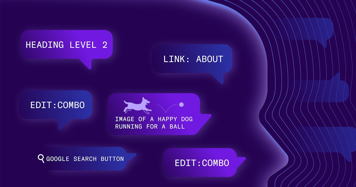
Blind and visually impaired people often use screen reading software to operate their computers, phones, and tablets. And while this technology enables them to lead independent lives, it also affects how they perceive digital content.
To help you understand what it’s like to use a screen reader — and why designing for accessibility matters — I want to take you inside the mind of a blind person using JAWS to navigate the most-visited website in the world: Google.
Before our journey begins, there are a few things to know:
- Screen readers only announce information on a page that is coded for them. For example, a screen reader will not announce the colors of Google’s logo because this information is not provided.
- Screen readers do not move through a page by default. Instead, they enable users to navigate the page by using shortcut keys to jump by heading, link, button, and other programmable elements.
Screen readers usually navigate a page in sequential order, starting in the upper-left corner and working through the header, top menu, main content, and footer. However, this is not always the case — and can be adjusted as needed (for example, in the case of Google’s search bar).
With this in mind, let’s explore Google’s homepage!
Getting Started
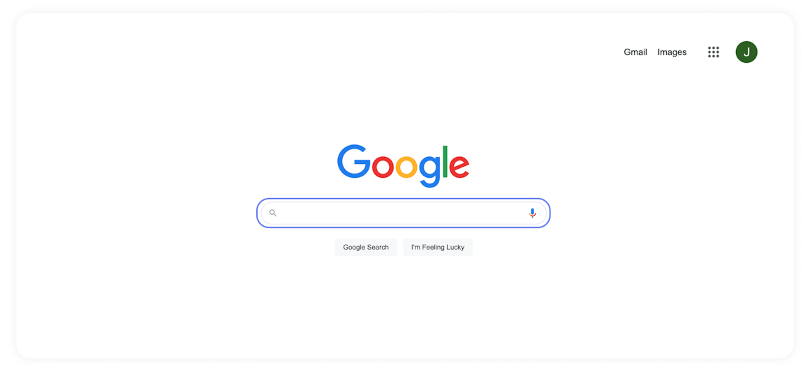
When the page first loads, focus is placed on the search field, which triggers a screen reader’s interactive mode. This means a user can immediately start typing their search query. It’s also a good example of designing with accessibility in mind. Google knows that most users are visiting to search for something, so it skips past different header and top menu links.
If the user exits the field and navigates to the top of the page, the screen reader will announce the first link: the “About” link. Using the down arrow to move the focus, the user encounters elements one at a time:
- Link: About
- Link: Store
- Link: Gmail
- Link: Images
As you can see, each element starts with “Link.” Not all elements are announced this way but, somewhere in the announcement, the type of element will be told to the user.
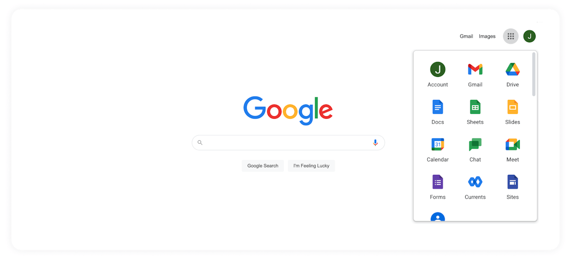
This is one of the context clues blind people use to predict the result of interacting with an element on the page. For example, the expected behavior of these links would be for a new page to load. However, the next element on the page — the Apps menu — is announced as “Google Apps Button Collapsed.” (Image above) Contextually, a screen reader user with enough experience on the internet should know that this will show new content on the current page.
Browsing the Entire Page
The down arrow is the only key needed to experience a page in its entirety, since JAWS automatically enters and exits its interactive mode. Many screen reader users will go through an entire page on their first visit. As they learn the page — building a mental map of its components and how they relate to each other — they will create their own strategies for quickly navigating the page on future visits.
There’s a pretty simple reason for this. Without the ability to take in a page at a glance, blind internet users must either read all content or attempt to intuit a page’s structure on the fly, which can result in them missing vital information.
Knowing the elements on a page and how they function can help screen readers save time. For example, if a user needs to switch accounts before searching for something on Google, and they know that the element that offers this ability is the second button on the page, they could jump by button twice instead of using the down arrow to cycle through a bunch of links they don’t want. Small, time-saving tricks like this add up as the user’s familiarity with a page’s structure grows.
When it comes to the Web Content Accessibility Guidelines (WCAG), making sure that information, structure, and relationships conveyed through visual presentation can also be programmatically determined is an important part of WCAG Success Criterion (SC) 1.3.1 (Info and Relationships).
The user next comes to Google’s logo, which screen readers announce as “Google Graphic.” WCAG SC 1.1.1 (Non-text Content) directs that “all non-text content that is presented to a user has a text alternative that serves an equivalent purpose.”
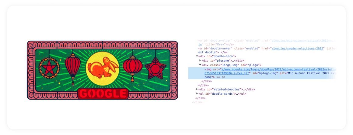
Google’s alt text for their logo is short and appropriately to the point. It simply says “Google.” And when the logo does change (as part of Google’s themed “Doodles” to celebrate holidays, anniversaries, and the lives of famous artists, pioneers, and scientists), the company takes time to update the alt text with additional context.
As the user continues moving through the page, JAWS announces “Search” and then “Edit Combo” with one more arrow. “Edit” refers to another common element — an edit or input field. In this case, “Combo” refers to the fact that the edit field is also a combo box. This is how JAWS tells the user that arrows can be used to find search suggestions.
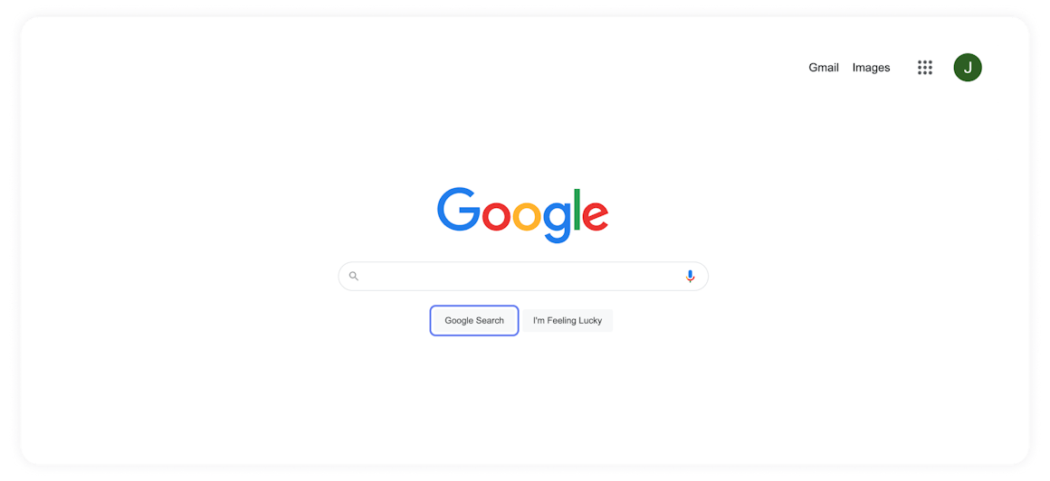
Next, JAWS announces the “Search By Voice Button,” the “Google Search Button,” and the “I’m Feeling Lucky Button.” Because each button has functionality that relates to the search field, they are easy to find with arrows or by hitting the tab key. This also mimics a common mouse and monitor user’s experience, something that can be tricky to implement.
Finally, we reach the “Settings” menu at the bottom of the page. Similar to other menus found across the Windows experience, this menu announces the position of the selected item in the list and the total number of items in the menu (for example: “Search Settings 1 of 7.”) The additional information helps contextualize this as a menu and provides feedback while the user experiments with the control for the first time.
Why Use Google to Demo the Screen Reader Experience?
Google’s home page is often used to train first-time screen reader users on basic web navigation for three reasons:
- It provides examples of common elements and controls that users will find on the internet.
- The experience is relatively simple compared to most sites.
- It serves as a jumping off point that users will return to time and again, helping them build confidence each time they need to look up information.
In fact, I was trained on Google as a child. Yet as simple as the flow is, putting all of these tricks and best practices together into a strategy for seamless browsing can take years of constant practice, experimentation, and frustration. Failure is a constant companion to people who use assistive technology as we look for new strategies to bypass the accessibility barriers we encounter every day.
97% of the internet today is inaccessible, but websites like Google help provide a roadmap for what an understandable, useful, and accessible experience can look like for all users.
Ready to see AudioEye in action?
Watch Demo
Ready to test your website for accessibility?
Share post
Topics:
Keep Reading
Newsletter Best Practices for Screen Reader Use
Newsletters are a common tool used in marketing teams. Discover how to make these content types more accessible for individuals with disabilities from AudioEye A11iance Member Jessica Phillips.
community
March 27, 2025
Types of Assistive Technology Tools
Learn about the different assistive technologies that people with disabilities use to browse your website and how you can increase compatibility with them.
community
February 08, 2025
What It’s Like to Shop Online When You’re Blind
Online shopping is often frustrating and inaccessible for blind users, but accessibility fosters confidence and loyalty.
community
January 21, 2025
