3 Tips on Writing for Accessibility

Ready to see AudioEye in action?
Watch Demo
Learn how the best practices of copywriting — from clear value props to short, scannable blocks of content — overlap with the best practices of digital accessibility.
If you asked any marketer to share their golden rules of copywriting, they'd probably say something like:
- Keep it simple.
- Lead with the most important information.
- Don't waste your readers' time.
And if those sound a bit basic to you ... good! The best copywriting isn't overly clever or verbose, but clear and direct.
That's also true of accessible writing. When you're writing for an audience that includes screen reader users and people with cognitive impairments, you should aim for clarity and brevity.
With that in mind, here are three places where the best practices of copywriting and digital accessibility collide — and how you can apply them to your own business:
1. Make Sure Your Site Is Scannable
As a copywriter, you’re often given character limits that can feel challenging — if not outright impossible. For the subject line of an email, you might get 65 characters. For the headline of a display ad, you might only get 25.
Restrictions like this force you to be ruthless with every keystroke, and prioritize the words that pack the biggest punch. With the way most users read the internet (hint: they don’t), you need to make sure they can scan your page and pick out the most important ideas.
That mentality is also important for digital accessibility — the practice of designing and developing websites, tools, and technologies in a way that people with disabilities can use them.
In a recent post, AudioEye A11iance Advocate Charles Hiser shared an inside look at how screen reader users typically navigate a website. According to Charles, many screen reader users will go through the entire page on their first visit, using their keyboard to jump between HTML headers and get a sense of what each section covers.
If your headers aren’t descriptive — or if you don’t use headers to separate ideas and break up large sections of text — it can be hard for a screen reader user to skim your page and decide if they want to read more.
Learn more about accessible page headings, typography, and layouts →

2. Details Matter, But Focus On the Right Ones
For marketers, it can be tempting to try and stuff multiple value props into every headline or ad.
It takes a lot of restraint to only focus on what customers need to know about your business. But having that discipline — not to mention the ability to recognize what information matters most — is an important skill, whether you’re trying to write ad copy or image alternative text (alt text).
Alt text is a written description of an image that screen readers can read out loud — or convert to Braille — for people with visual impairments, sensory processing disorders, or learning disorders.
Done right, alt text can help paint a fuller picture of your products and services for people who cannot perceive images visually. Unfortunately, alt text can also go wrong in a number of ways.
- It can be forgotten entirely.
- It can lack sufficient detail (for example: alt text that simply says “size chart” for an image of a clothing size chart).
- It can be weighed down by so much information that a screen reader user doesn’t know where to focus.
The best version of alt text is one that leads with the most important information, without adding too many extraneous details.
For example, instead of simply describing a stuffed animal of a turtle as “image of stuffed animal,” you could write “A large stuffed animal of a smiling turtle. It is soft and fuzzy, with light green skin and a brown shell.”
For people who cannot perceive images visually, not only will they know what kind of animal they’re looking at, but they’ll have important contextual details about its look and feel.
Want more alt text tips? Learn how the design team at AudioEye uses AI image generators to check their alt text, or discover what the wine industry can teach us about writing effective alt text.
3. Clear, Descriptive Content Is Good for Everyone
The World Wide Web Consortium’s (W3C) Supplemental Guidance to WCAG 2 includes best practices for clear and understandable content, such as:
- Use active rather than passive voice: Speaking directly to the user in an active voice can help with comprehension, especially for people with dyslexia and other language impairments. For example, more people will understand “press the button” than “the ‘on’ button should be pressed.”
- Avoid double negatives or nested clauses: Clear, simple language can help people with dyslexia and other language impairments understand a page — and any key actions they should take. For example, “Time is limited” is clearer than “Time is not unlimited.”
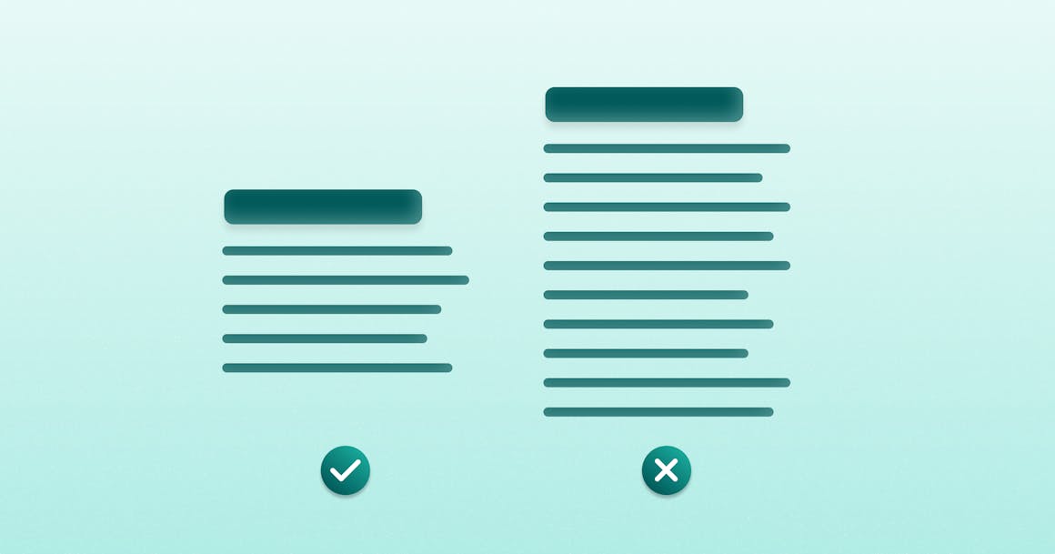
- Be concise and avoid long, dense paragraphs: Use short sentences with one point per sentence. Try to insert the key takeaway or objective at the start of the paragraph. When possible, use bulleted or numbered lists.
Of course, each of these recommendations could also be considered a general writing best practice.
Digital Accessibility Doesn’t Have To Be Complicated
I mentioned earlier that I’m relatively new to the digital accessibility space. But now that I know the best practices of digital accessibility, it’s hard not to notice how often they overlap with “good” writing or design.
Want to get more tips on how you can provide accessible online experiences? Subscribe to AudioEye’s newsletter to get the latest accessibility news and tips delivered to your inbox.
Ready to see AudioEye in action?
Watch Demo
Ready to test your website for accessibility?
Share post
Topics:
Keep Reading
7 Websites That Got Accessibility Right (and What You Can Learn)
Looking to create an accessible website? See how seven companies utilized accessibility best practices to create a seamless user experience that works for all.
accessibility
April 11, 2025

Why People + Automation Is the Right Approach to Accessibility Testing
Discover how using both automated and manual accessibility testing is the perfect approach to creating accessible, compliant digital content.
accessibility
April 08, 2025
Is WCAG Certification Possible? 6 Things You Need to Know
While WCAG standards don’t offer official certification, there are training programs and professional credentials that can boost your accessibility expertise. Learn more.
accessibility
April 03, 2025
