2023 Design Trends That Aren’t Accessible
2023 Design Trends That Aren’t Accessible


Ready to see AudioEye in action?
Watch Demo
Learn how some of the latest design trends can actually create accessibility barriers for people with disabilities.
As a designer, it pains me to push back on some of the latest design trends. I think everyone should be able to express themselves fully. And I believe that pushing the boundaries of design helps us move it forward, one pixel at a time.
However, I get worried when I see the best practices of accessible design cast aside in favor of designs that are new or bold. I can’t help but wonder how these trends will affect real users — and especially people with disabilities.
I’ve always felt that there’s an intrinsic link between art and design. Life imitates art, and design follows. Where they differ is the importance of functionality. A design is fundamentally flawed if it is unusable, whereas art merely needs to be appreciated.
All this to say: Designers and developers of the world … keep showcasing beautiful websites! But please think of your entire audience when you do — and how your design choices affect the one in six people globally (yes, that’s more than a billion people) who live with some type of disability.
With the disclaimer that I like many of these styles, let’s dive into some of the least accessible design trends of 2023.

1. Y2K (the Y Stands for Yikes)
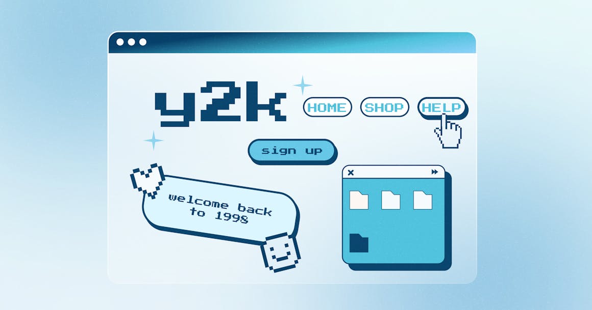
As a millennial, I adore the Y2K renaissance we’re experiencing in web design today. It brings me right back to my clunky Neopets / Ask Jeeves / GeoCities childhood. Unfortunately, this trend also lacks a certain legibility. Pixelated text, harsh contrast buttons, scattered navigation, and custom mouse cursors may add a little whimsy, but they also leave much to be desired from an accessibility perspective.
Before you lean too hard into the nostalgia, consider the following accessibility best practices:
- Pixelated text is hard to scan and read — and it can be especially difficult for people with dyslexia or dyscalculia to differentiate words or numbers.
- Classic Y2K neon color schemes can be intense and cause eye strain.
- Unexpected flashing animations can cause seizures for people with epilepsy. According to the Web Content Accessibility Guidelines (WCAG), users should be able to pause, stop, or hide “any moving, blinking, or scrolling information that (1) starts automatically, (2) lasts more than five seconds, and (3) is presented in parallel with other content.”
.jpg?ixlib=gatsbyFP&auto=compress%2Cformat&fit=max&w=1160&h=609)
2. Taking Minimalism Too Far
One of the most popular design trends today is minimalism. Unfortunately, in an effort to embrace white space, some designers hide too many critical elements.
It may sound tempting to design an ultra sleek, minimalist layout, but if your site’s functionality suffers as a result, you should reconsider your priorities. Is the goal of your site to look good at a glance, or be a useful tool for visitors to find the information they want?
Think about this the next time you use a hamburger menu on a website. Can you imagine if McDonald’s hid their menu at the drive thru? Okay, now I’m just thinking about burgers, but you get the idea.
Additionally, most minimalist sites have serious issues with color contrast. It may be aesthetically pleasing to have subtle gray text on a white background, but it’s a nightmare for people with low vision or color vision deficiency (commonly referred to as color blindness).
We can’t only design for 20-year-olds with perfect eyesight. We need to keep things like color contrast and font size in mind — and remember that we can create accessible sites that still look great.
Want to check your site’s color contrast? Try AudioEye’s free Color Contrast Checker to see if you meet the WCAG standard for contrast ratio →
.jpg?ixlib=gatsbyFP&auto=compress%2Cformat&fit=max&w=1160&h=609)
3. Dark Mode, Without the Dark Mode Work
Dark mode is wonderful. It’s known to help with eye strain, and it can contribute to immersive, mysterious, and elegant experiences.
However, it’s important to design for dark mode from the beginning. You need to be conscious of things like link colors, contrast levels, the stroke width of icons, and even the use of transparent images. These might seem like easy changes, but each one should be considered if you want to make dark mode work.
.jpg?ixlib=gatsbyFP&auto=compress%2Cformat&fit=max&w=1160&h=609)
4. Interactive 3D & Parallax
If your site requires people to drag a cursor to navigate a page or interact with an element, you risk becoming completely inaccessible to some visitors. After all, many people use a sip and puff switch or keyboard alone to navigate websites.
If the point of your page is to see something in 3D and there is no way to view all angles without clicking and dragging, the user experience will be subpar even if the page is technically accessible. Instead, try and find ways to allow users to interact with the element using keyboard commands.
Additionally, these experiences can be jarring when they include fast animations. If you use animations on your site, be sure to give people a way to turn them off.
Learn More About Accessible Design
Ready for more accessible UX design tips from AudioEye’s team of accessibility experts? Read our post on 3 Accessibility Mistakes Almost Every Designer Makes or download our Ultimate Guide to Accessible Web Design (it’s free!) for a resource you can return to whenever you need help with link accessibility, site architecture, media and document accessibility, and more.
Want to know where your website stands today? Enter any URL into the field below to get a free scan of your page for accessibility issues.
Ready to see AudioEye in action?
Watch Demo
Ready to test your website for accessibility?
Share post
Topics:
Keep Reading

7 Websites That Got Accessibility Right (and What You Can Learn)
Looking to create an accessible website? See how seven companies utilized accessibility best practices to create a seamless user experience that works for all.
accessibility
April 11, 2025

Why People + Automation Is the Right Approach to Accessibility Testing
Discover how using both automated and manual accessibility testing is the perfect approach to creating accessible, compliant digital content.
accessibility
April 08, 2025

Is WCAG Certification Possible? 6 Things You Need to Know
While WCAG standards don’t offer official certification, there are training programs and professional credentials that can boost your accessibility expertise. Learn more.
accessibility
April 03, 2025
