10 Web Design Principles to Increase Accessibility

Ready to see AudioEye in action?
Watch Demo
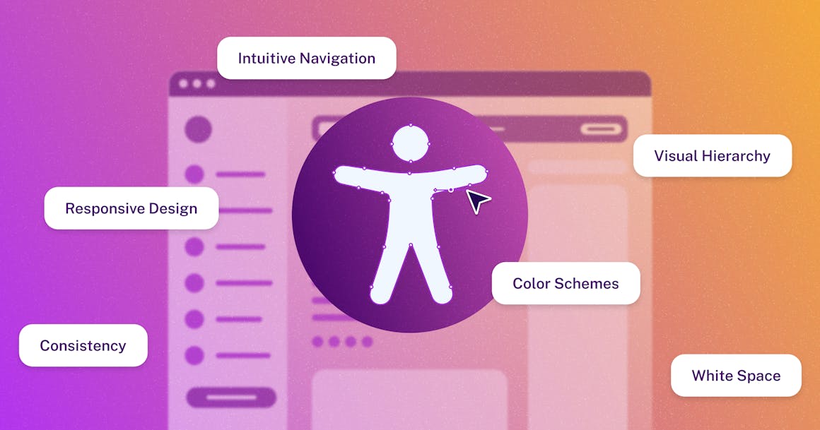
Accessible web design ensures individuals with disabilities can easily access and use digital content. Unfortunately, it's often overlooked in the design process. Below, we'll discuss 10 web design principles that can be used to improve the user experience for individuals with disabilities.
In today’s digital age, where the internet serves as a primary source of information and interaction, website design plays a key role in shaping how customers feel about organizations.
In fact, research indicates that a well-designed website can significantly improve user perception and satisfaction, with 94% of first impressions being design-related.
Yet, despite the importance of good web design, creating websites and digital experiences that are accessible to the 1 in 6 people globally with a disability is sometimes overlooked. In fact, the 2024 WebAIM Million report found that 96% of the world’s top one million home pages are inaccessible to people with disabilities, underscoring the need for organizations to prioritize digital accessibility and inclusion.
In this blog, we’ll break down some of the key elements of accessible web design — and share tips on how organizations can deliver digital experiences that work for all users.
What Is Web Design?
Web design is the process of creating websites and web pages that are visually appealing, user-friendly, and reflect a company's brand. At its core, effective web design balances creativity with practicality. More simply, it’s all about ensuring content is easy to understand for all users, in all environments.
The basic tenets of web design — such as visual hierarchy, consistent navigation, and clear, simple content — serve as guidelines to help designers create websites that are easy to use.
How Does Accessibility Impact Web Design?
Accessible web design is the practice of designing websites and digital experiences in a way that people with disabilities can easily navigate, consume, and interact with the content. It differs slightly from the traditional web design process in the sense that it focuses on designing digital content that’s accessible and usable specifically for individuals with disabilities.
According to the Web Content Accessibility Guidelines (WCAG), there are four key principles that lay the foundation for accessible web design. For a website to be accessible, it must be:
- Perceivable: Information and user interface (UI) components must be presentable and perceivable to all users.
- Operable: UI components and navigation must be operable by all users.
- Understandable: Website content and operation of the UI must be understandable to all users.
- Robust: Content must be robust enough for all users and assistive technologies to interpret it reliably.
By incorporating accessible design practices, websites become more navigable and usable for everyone, regardless of their physical or cognitive abilities.
As an added benefit, many of the principles of accessible web design — such as clear, consistent navigation, adequate color contrast, and multiple ways to engage with multimedia content — benefit all users.
10 Web Design Principles that Improve Accessibility
1. Design with All Users in Mind
Ensure your design is inclusive and accessible to all users, regardless of their abilities. Be wary of relying too heavily on visual or auditory cues, which can make it difficult for people with visual or hearing impairments to fully interact with a web page.
2. Establish a Clear Visual Hierarchy
Layout and font styling can help organize content so that important information stands out clearly, helping users prioritize what to read on a website. However, it’s important not to fall into the trap of relying on visual styling alone to communicate hierarchy; be sure to also use headings — which range from <H1> to <H6>, with the highest level being <H1> — to outline document structure for screen reader users.
3. Embrace White Space
According to the World Wide Web Consortium’s (W3C) Supplemental Guidance to WCAG 2, putting white space around objects and text can help reduce clutter and draw focus to important content.
For people with cognitive or learning disabilities, white space has been shown to ease reading difficulties and improve comprehension. And like other accessibility best practices, it has the added benefit of making pages easier to navigate and read for everyone.
4. Provide Clear, Consistent CTAs
Avoid overwhelming users with too many calls to action (CTAs) at once. According to WCAG Success Criterion (SC) SC 2.4.4: Link Purpose (In Context), it is best practice for links with the same destination to have consistent text. In other words, you don’t want to use CTAs like “Read more” and “Learn more” interchangeably if they are pointing to the same destination.
5. Choose Accessible Fonts
Clear, legible fonts (or typefaces) make it easier for people to understand your content. Serif fonts work well for long blocks of text, while sans-serif fonts work well for mobile apps and user interfaces. Be careful about using decorative fonts (i.e., cursive or handwritten styles), which add plenty of style but can make it harder to read and navigate.
6. Keep Navigation Simple
Design menus and navigation bars that are clear, logically organized, and easy to use. You can also use icons, images, or hover effects to provide visual cues that aid navigation and understanding, although images and icons should have an alt text description that clarifies their purpose and meaning.
Including breadcrumbs can also help users understand their location within the website and navigate back easily.
7. Use Active Voice
Speaking directly to readers in an active voice can support comprehension, especially for people with dyslexia and other language impairments. For example: More people will understand “press the button” than “the button should be pressed.”
Similarly, you should try to insert the key takeaway or objective at the start of a paragraph.
8. Make Your Website Mobile Friendly
When it comes to mobile accessibility, small screen sizes can make it difficult for some people with motor disabilities to comfortably navigate between pages.
Any on-screen element that someone can click, touch, or otherwise interact with should be large enough for reliable interaction. According to WCAG, the minimum touch target size for buttons and at least one of two adjacent links (or equivalent targets) must be at least 44x44 CSS pixels.
You should also have enough padding between your links to help ensure users don’t click or tap the wrong one by accident.
9. Strive for Simplicity
Simplicity in web design is not merely about aesthetics; it directly impacts accessibility. By simplifying design elements and interactions, websites become more navigable and comprehensible for users with disabilities, cognitive impairments, or those accessing the site under less-than-ideal conditions.
10. Use Accessible Color Schemes
Color is one of the most powerful tools in a designer’s arsenal, but the colors we choose (and how we implement them) can make it difficult for people with low vision or color blindness to fully perceive, navigate, or understand digital content.
As a best practice, you should avoid using color as the only element that gets your users’ attention — or alerts them to key information. If you do use color to communicate information, be sure to combine it with another element (such as an error message or symbol) to help people with color deficiencies follow along.
You should also avoid digital black typeface or pure black on a pure white background — the stark contrast may cause eye strain.
What Are the Benefits of an Accessible, Inclusive Website?
Creating an accessible web design not only improves usability but also yields several tangible benefits:
- Digital accessibility can help you reach more customers: One of the biggest misconceptions about digital accessibility is that it’s an edge case — and an inaccessible website won’t affect that many people. In reality, over 1.3 billion people globally live with a disability — making the disabled community one of the largest audience segments in the world.
- Digital accessibility is good for everyone: The primary goal of digital accessibility is ensuring equal access for all users, regardless of ability. But that doesn’t mean designers need to compromise on design. In fact, many of the best practices of digital accessibility are closely aligned with the basic tenets of UI/UX design, such as clear, consistent navigation, clearly defined information hierarchy, and giving users control over how they access content.
- Digital accessibility supports discoverability: There’s also a clear link between accessibility and search engine optimization (SEO). For example: Sites with clear, descriptive headings — which support navigation and comprehension for people with disabilities — are also easier for search engines like Google to crawl. In fact, Google Search Essentials (which outlines the best practices that help Google find, index, and rank websites) reads like accessibility guidelines — and often directly correlates with WCAG.
- Digital accessibility can improve brand reputation: More than ever, people want to be associated with companies that share their values — especially when it comes to things like sustainability and inclusion. In fact, a recent study found that consumers are 6x more likely to protect a company’s image when a brand develops a strong perspective on social and environmental issues.
Create Digital Content That Works for All Users
Following the best practices of accessible web design doesn’t just help protect your organization from the risk of legal action; it can also improve user satisfaction and engagement for all users, regardless of ability.
At AudioEye, our combination of automated accessibility technology and expert human support can help you deliver accessible, compliant digital experiences. From automated accessibility fixes to expert human testing and accessibility training, our team of experts can help you ensure your website meets the highest standards of accessibility while maintaining excellent design principles.
Get started with a free accessibility scan or try our free color contrast checker.
Ready to see AudioEye in action?
Watch Demo
Ready to test your website for accessibility?
Share post
Topics:
Keep Reading
7 Websites That Got Accessibility Right (and What You Can Learn)
Looking to create an accessible website? See how seven companies utilized accessibility best practices to create a seamless user experience that works for all.
accessibility
April 11, 2025
Why People + Automation Is the Right Approach to Accessibility Testing
Discover how using both automated and manual accessibility testing is the perfect approach to creating accessible, compliant digital content.
accessibility
April 08, 2025
Is WCAG Certification Possible? 6 Things You Need to Know
While WCAG standards don’t offer official certification, there are training programs and professional credentials that can boost your accessibility expertise. Learn more.
accessibility
April 03, 2025
