10 Best Fonts for Dyslexia

Ready to see AudioEye in action?
Watch Demo
Font plays a huge role in how accessible a website is for individuals with dyslexia. Discover which fonts are most accessible and how to incorporate them into your web design below.
Dyslexia is by far the most common learning disability, affecting about 20% of the population. For businesses, that means a considerable portion of your audience might have difficulty navigating your website, reading product descriptions, or making purchases if your digital content doesn’t have a readable font.
And while there are certain safeguards you can adopt, the most user-friendly solution is to use an accessible font from the beginning.
Below, we’ll share some of the best fonts for dyslexia — and provide a few more tips for creating a browsing experience accessible to everyone.
What is Dyslexia?
Dyslexia is a learning disability that makes it difficult for individuals to read, write, and spell. It’s called a learning disability because it impacts someone’s learning or reading experience, making it more difficult to process information. However, dyslexia is not related to intelligence. It simply means people with dyslexia need more time or a different way to process information.
A few common characteristics of dyslexia include:
- Difficulty recognizing or decoding words.
- Flipping, reversing, or swapping letters (e.g., confusing “d” and “b” or “saw” and “was”).
- Low spelling or writing skills.
- Difficulty reading all capital or uppercase letters.
- Slower reading speed.
- Difficulty understanding or remembering instructions.
What Are Dyslexia-Friendly Fonts?
Dyslexic-friendly fonts are typefaces designed for individuals with dyslexia. They include specific characteristics that make it easier for dyslexic people to recognize and distinguish between words and letters.
A few characteristics of dyslexic fonts include:
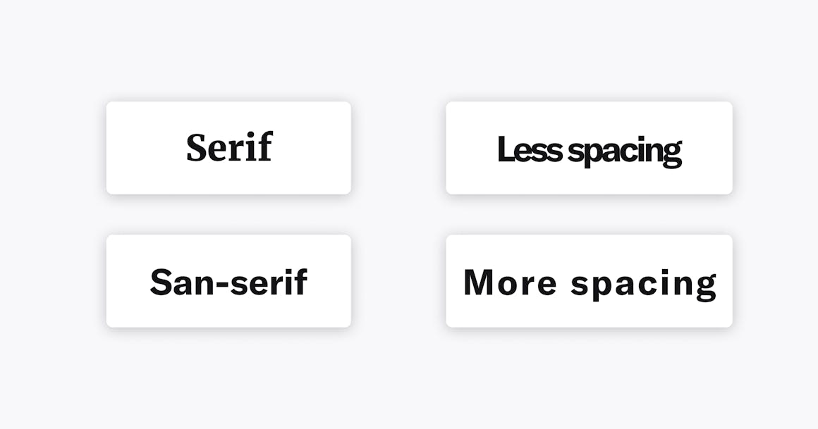
- Simple letter shapes: Most dyslexic-friendly fonts have simple, more straightforward letter shapes to help reduce confusion between similar letters.
- Precise letter spacing: Adding more spacing between letters decreases spaces and overlapping, which increases readability.
- Consistent letter height: Fonts with a similar letter height can decrease the tendency for readers to rotate or flip them.
- Open, rounded shapes: Typographies with more open and round letter shapes are more accessible for readers to distinguish, which helps reduce visual confusion.
- Heavier weights: Fonts that are bolder or heavier can improve letter recognition as they’re more distinctive and more accessible to recognize.
Best Practices for Dyslexia-Friendly Fonts
Because dyslexia affects people differently, there isn’t one magic font that works for everyone. However, there are some best practices for choosing an accessible font for dyslexic readers:
- Use a sans serif font: Serif fonts are typefaces with extra strokes (commonly referred to as tails) attached to the end of each letter. These strokes can make it harder to distinguish between letters. For example, Times New Roman is a serif font with tails attached to it. Arial is a sans serif font because it does not have tails.
- Make sure there’s enough space between letters: Character spacing or kerning also plays a vital role in accessibility for individuals with dyslexia. Without enough spacing, it can impact legibility for dyslexic readers. For example, r and n can look like m without enough line spacing.
- Consider fonts designed for dyslexia: Often characterized by heavy, bolder bottoms that give each letter a unique shape, new fonts have been created specifically for dyslexia (like OpenDyslexic). These fonts also help to prevent letter flipping.
10 Best Fonts for Dyslexia
While the Web Content Accessibility Guidelines (WCAG) don’t require a specific typeface, they recommend choosing one that is simple and unadorned. Here’s a list of both paid and free fonts for dyslexia.
1. Arial
Arial is one of the most widely-used fonts on the internet — and for good reason. It’s on just about every program you can think of, and it doesn’t require a license. It’s also clear and easy to read.
Like all fonts on this list, Arial is sans serif. Letters are generally not squished together, and their roundness clearly defines them.

2. Helvetica
Helvetica is the most-used font of all time, popular among big brands, and a favorite choice for public signage since the 1960s.
It’s not quite as rounded as Arial, but its lack of serifs and evenly spaced letters make it one of the best for dyslexia accessibility.

3. Comic Sans
Comic Sans is a much-maligned and unpopular font, especially among graphic designers, yet it’s one of the most dyslexia-friendly fonts.
As the name implies, Comic Sans is a sans serif font. It was designed to mimic the typeface often used in comic books. Its playful design provides easy-to-distinguish letters that can be helpful for people with dyslexia.

4. Verdana
Explicitly designed for on-screen reading, Verdana features wide spacing between letters, is readable at a small size, and is sans serif.

5. Century Gothic
In Century Gothic, letters are easily distinguishable and well-spaced, with rounded tops and bottoms. Some letters lean on the thin side, but overall, this font is quite accessible.

6. Tahoma
Although it lacks the fanfare of fonts like Arial and Helvetica, Tahoma is another widely used font.
Tahoma’s lines are bold and straightforward, without any frills you often find with serif fonts. Each letter also has its own space, which makes it easier to read.

7. Calibri
Like Verdana, Calibri was designed for on-screen reading. It has been the default font in Microsoft Office Suite since 2007.
Calibri has noticeably wide letter spacings, making it easy to read in large and small texts.

8. Open Sans
Open Sans is another example of a straightforward, no-frills font. Created for Google, it’s free to use with an open-source license.
Open Sans has clear spacing, tall letter sizes, and rounded shapes, making the typeface easy to read.

9. Dyslexie
Designed by Christian Boer (who has dyslexia), the Dyslexie font was created specifically for people with dyslexia. It features long stems, unique shapes, and heavy, bolder bottoms. Each feature is meant to give each letter its qualities and make each one easily distinguishable.

10. OpenDyslexic
OpenDyslexic is another specialized font explicitly designed for those with dyslexia, with heavy bottoms and thin tops that are meant to prevent letter flipping. Letters are well-spaced, and each letter has a unique style.
OpenDyslexic is entirely free and open-sourced.

More Tips for Making Your Digital Content Accessible
Making your digital content accessible for individuals with dyslexia is a great first step to increasing overall accessibility. There are several other steps you can take to ensure your site is accessible to a broader audience and those with other disabilities. For example:
- Make sure you are using a minimum 12-point font.
- Align text left instead of having it entirely justified.
- Use simple, succinct language and avoid jargon.
- Optimize your site for assistive technologies, including screen readers.
- Ensure you have good color contrast across your digital content.
Each of these best practices and using dyslexic-friendly fonts helps you create beautiful websites that work well for users. Plus, they allow you to meet accessibility laws and recommendations, including those in the Americans with Disabilities Act (ADA).
Want more tips on how to create an accessible website? Check out our Ultimate Guide to Web Design.
Ready to see AudioEye in action?
Watch Demo
Ready to test your website for accessibility?
Share post
Topics:
Keep Reading
7 Websites That Got Accessibility Right (and What You Can Learn)
Looking to create an accessible website? See how seven companies utilized accessibility best practices to create a seamless user experience that works for all.
accessibility
April 11, 2025
Why People + Automation Is the Right Approach to Accessibility Testing
Discover how using both automated and manual accessibility testing is the perfect approach to creating accessible, compliant digital content.
accessibility
April 08, 2025

Is WCAG Certification Possible? 6 Things You Need to Know
While WCAG standards don’t offer official certification, there are training programs and professional credentials that can boost your accessibility expertise. Learn more.
accessibility
April 03, 2025
