LINK ACCESSIBILITY TIPS
Vague links can make browsing websites an (unwelcome) adventure.
When it comes to page links, most organizations default to short phrases like Shop All or Learn More.
And while this approach might be good enough for people who can take in the surrounding information on a page at a glance, it does little for screen reader users who typically browse a page by skipping from link to link.
In order to be accessible, all page links should tell users exactly where clicking it will take them — either in the actual link title or by adding a link title that screen readers and other assistive technology can read out loud.
64% of pages had links that lacked critical context for people with disabilities.
Our automated scan found that nearly 11 million links — or roughly 5 per page scanned — were inaccessible to people with visual or cognitive impairments, making it hard for them to quickly navigate between pages.


After scanning 357 million links, it’s clear that link accessibility is a persistent issue for most enterprise sites. In fact, our scan revealed that 90% of sites had at least one page with an inaccessible link, and 64% of pages had at least one inaccessible link.
90%
of sites had at least one page with an inaccessible link
64%
of pages had at least one inaccessible link
~5
number of links per page that are not clear to users
Images as links have their own set of rules.
Link accessibility doesn’t end with text links, either. If an image is being used to link to another page, the alt text should describe what will happen when the image is clicked, rather than what it looks like.
For example, the alt text for an image of a headset that links to a customer support page should say “Contact Support” instead of “headset.” During our scan, the average page had 9 images as links — and 21% of them were improperly labeled.
21%
of images as links are improperly labeled, meaning they don’t tell screen reader users where clicking the image will take them.
BEST PRACTICES
The ‘link’ between accessibility and descriptive links
To understand why descriptive links are so important for accessibility, it helps to understand how screen reader users typically navigate a web page.
Many screen reader users will skim through the entire page on their first visit, using their keyboard to jump between links and headers. It’s similar to the way a sighted user might scroll through a page, glancing at links and headers to figure out what the page covers — and where they want to click next.
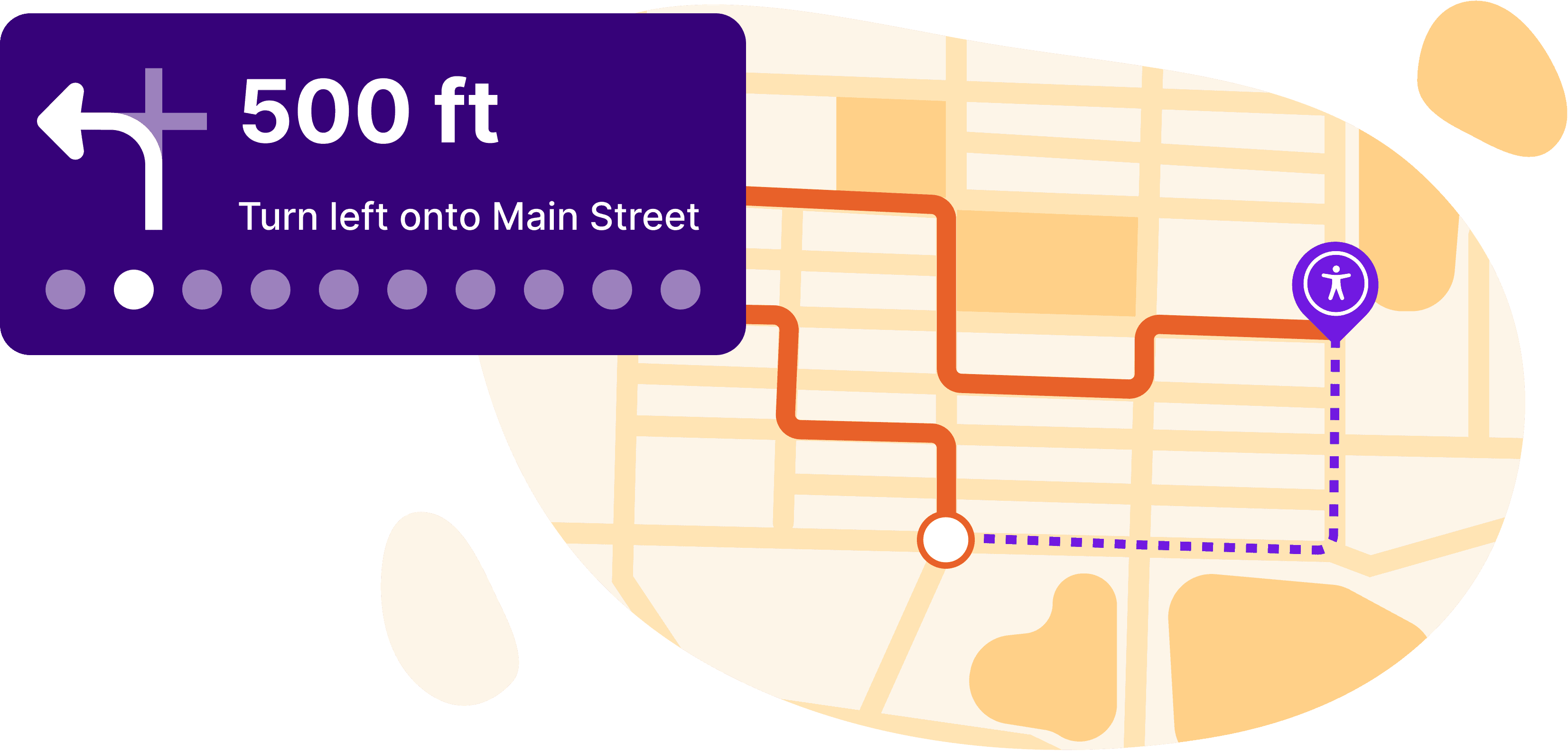
If you think about driving, links on a page are kind of like GPS directions. A directive to “Turn!” isn’t all that helpful, whereas “In 500 feet, turn left onto Main Street” tells you exactly what to expect.

If the links on your page aren’t descriptive, it forces screen readers to go back and read the text surrounding a link to (hopefully) understand where it’s pointing, slowing them down and impacting the user experience.
Example of a non-descriptive link:
![A car with a faux link that reads “Click here” with an error symbol next to it to represent an inaccessible link.]()
Example of a descriptive link:
![A car with a faux link that reads “View our collection of model cars” with a checkmark next to it to represent an accessible link.]()

