RETAIL
Accessibility barriers are driving customers away.
Along with friends and family, people with disabilities control almost $13 trillion in disposable income globally. Yet despite their buying power, 54% of assistive technology users believe online retailers don’t care about earning their business.
When we asked members of the disability community what it was like to shop online, many of them noted that accessibility barriers are a persistent challenge — especially when it came to essential activities like viewing product photos, purchasing items, or managing their account information.
“It’s genuinely disheartening. And it’s way too common. I could not tell you how many times I’ve been unable to access my cart, fill out my shipping information, or solve the CAPTCHA.”
Chris Preiman | AudioEye A11iance Member & Internet Security Professional
EXPERT AUDITS
Breaking down the most significant barriers on the top retail sites.
Our expert review of the top retail sites revealed many of the same issues as our automated scan — plus a number of significant accessibility barriers that made it difficult for people to navigate between pages, add items to their cart, or be alerted to missing information on checkout forms.
Across the four sites audited, our testers found another 17 accessibility barriers across the login, product, and checkout pages — including four consistent barriers that impacted their ability to make purchases.
1. No audible announcement when forms were missing required information.
Our experts found multiple forms on product and checkout pages that did not audibly announce when required information was missing, which can leave non-sighted customers unaware that their form was not submitted.
WCAG Criteria: 3.3.1: Error Identification;Opens in a new tab3.3.2: Labels or InstructionsOpens in a new tab
Disabilities Affected: Visual, Cognitive
2. No alert when items were added to a user’s cart.
Our experts encountered "Add to Cart" buttons that did not trigger an audible announcement when clicked, which can leave non-sighted customers unsure if an item has been successfully added — or if they’ve accidentally added multiples of an item.
WCAG Criteria: 3.3.1: Error Identification;Opens in a new tab3.3.2: Labels or InstructionsOpens in a new tab
Disabilities Affected: Visual, Cognitive
3. Buttons were not clearly labeled for people with visual impairments.
Our experts noted dozens of buttons that were not clearly labeled, meaning they had to click each one to figure out where it would take them. This can make it harder for non-sighted users to navigate a site, or take their desired action on a page.
WCAG Criteria: 4.1.2: Name, Role, ValueOpens in a new tab
Disabilities Affected: Visual, Cognitive
4. Error messages on forms lacked contextual detail.
Our experts noted several instances where a form was missing required information, but there was no audible announcement of what information to enter. This can be confusing for non-sighted customers and people with cognitive impairments.
WCAG Criteria: 3.3.1: Error Identification;Opens in a new tab3.3.2: Labels or InstructionsOpens in a new tab
Disabilities Affected: Visual, Cognitive
“It can be hard because there’s no public transportation where I live. So if I can’t buy what I need online, I have to find a sighted person to drive me to the store and hope they can find what I’m looking for.”
Wren Higginbottom | AudioEye A11iance Member
AUTOMATED SCAN RESULTS
Most common issues, retail sites.
Our automated scan revealed that retail sites have an above-average rate of multiple accessibility issues, including some (like image accessibility) that are a key part of shopping online.
Studies show that 75% of online shoppers rely on product photos to help them make a purchase decision, yet retail sites had one of the highest rates of inaccessible images across all industries.
Retailers also struggle with things like button and link accessibility, which can make it difficult for customers to navigate between pages, add items to cart, and more.
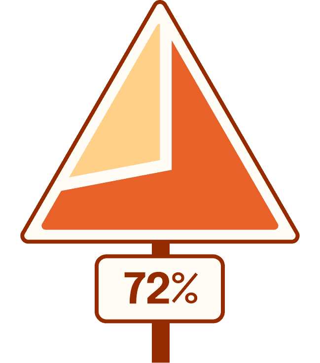
72% of retail pages had at least one image with missing or inadequate alt text.
Without descriptive alt text on product photos and other graphics, people with visual and cognitive disabilities can have a hard time understanding what an image is supposed to illustrate.
WCAG Success Criteria: 1.1.1: Non-Text ContentOpens in a new tab
Disabilities Affected: Visual, Cognitive
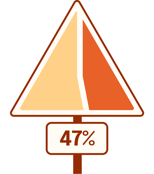
47% of retail pages with a form had at least one field that was not labeled.
Without descriptive field labels, it can be difficult for people with visual and cognitive impairments to add payment methods, enter shipping addresses, and more.
WCAG Success Criteria: 3.3.2: Labels or InstructionsOpens in a new tab
Disabilities Affected: Visual, Cognitive
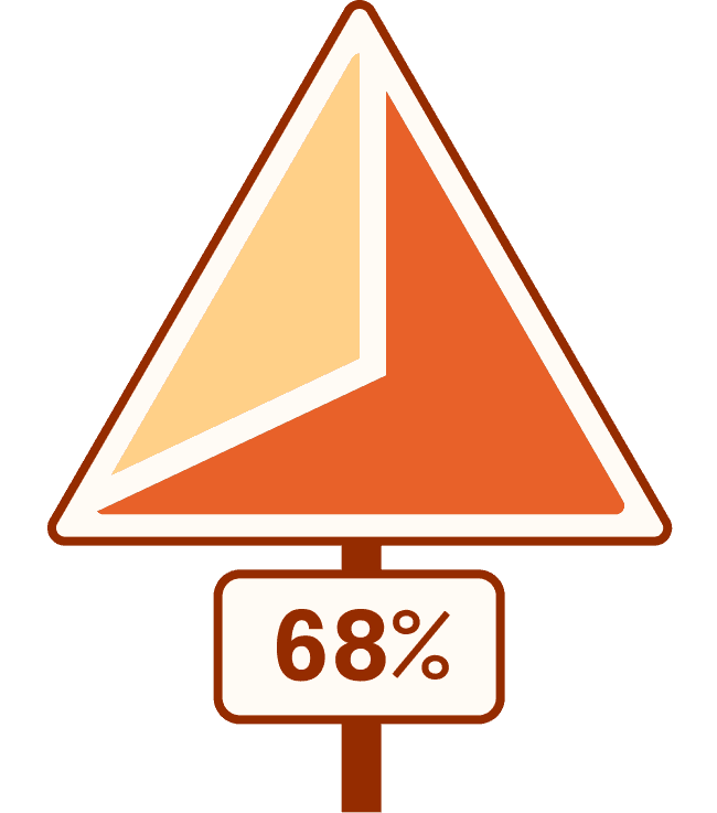
68% of retail pages had at least one link that did not clearly state where it would take users.
For people with visual and cognitive disabilities, clear, descriptive link text is a critical part of being able to navigate websites.
WCAG Success Criteria: 2.4.4: Link Purpose (In Context)Opens in a new tab
Disabilities Affected: Visual, Cognitive
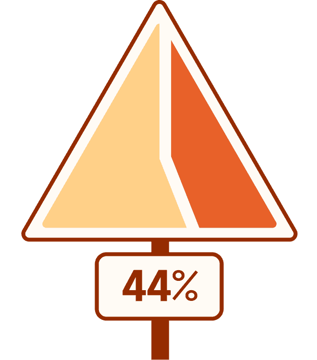
44% of retail pages had at least one button that did not clearly state where it would take users.
For people with visual and cognitive disabilities, clear, descriptive buttons is a critical part of being able to navigate websites.
WCAG Success Criteria: 2.4.4: Link Purpose (In Context)Opens in a new tab
Disabilities Affected: Visual, Cognitive
Get expert insight into the accessibility of your product pages and checkout flows.
Uncover accessibility barriers that are making it hard for people with disabilities to compare products or make a purchase with an expert audit of your site.